Top 14 intranet and digital workplace posts from 2014

As we head into 2015, we reflect on and recap our most popular blog posts from 2014. These are the posts that you, our readers, came to in droves, now gathered together in a handy list to be revisited, reread and reshared.
It’s here: 2015. According to Back to the Future: Part II, this is the year when we will get flying cars and hoverboards. So, while we wait with bated breath for the announcement, kick back, grab your beverage of choice and come with us on a journey through our top most-read blog posts of 2014.
Back to the basics, back to the future
As we scanned through the posts the statistics gave us, we were able to identify three trends:
- People still want practical guidance and advice on what a successful intranet looks like, from bringing social functionality onto the homepage, to knowing how to successfully implement tree testing on an intranet’s navigation with social intranet tools. This reflects what we’re seeing in our community: intranet teams are refocusing on getting the basics right, simplifying the user experience and seeking to create a more unified connection between systems.
- However, they are also starting to look to the future, with a steadily growing interest in digital workplace strategy. Organizations and teams are starting to pull the lens back from the intranet, to include the wider context of how, why, when and where people are interacting with digital tools in the workplace.
- People like lists and screenshots. I mean, really like them.
We’ve loved writing and researching these articles, so here they are again, presented in list form for your pleasure and interest: DWG’s top 14 blog posts of 2014.
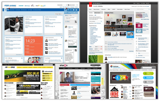
Announcing the winners of My Beautiful Intranet 2014 (with screenshots!)
We start off with a post that perfectly sums up what DWG is about: “Don’t journey alone”. My Beautiful Intranet 2014 brought us the best in design and functionality from teams across the globe. With intranets and mobile solutions so often hidden behind firewalls, it was fantastic to see them emerge blinking into the daylight, in all their splendour and glory.
It was a tight competition, but our winners were:
- Mobile track: Verizon
- Intranet: Dorel Juvenile Europe
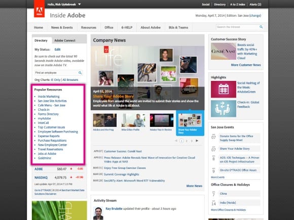
- Honourable mention: Adobe
- Rounding out the top 5 intranets: Mediterranean Shipping Company, PUB and Wheatley Group.
The entries showcased clean, simple form that successfully hides the complexity of function. The result of this is user-friendly, business-focused and integrated solutions. Truly deserving of the top spot in our list, this post drills down into what DWG is all about – helping those working with intranets and digital workplaces to learn together, and showing what is possible.
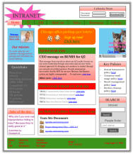
- We finally found the world’s best intranet

The winners of My Beautiful Intranet 2014 may have been all about combining beautiful, clean, simple design with great user experience and functionality, but none of them came close to the “world’s best intranet”.
If an element of creativity is about bringing together disparate ideas and challenging norms, then this intranet certainly did that. It broke all the rules in the book, including some rules that are not even in the book. I’ve been reliably informed that it caused designers and usability experts to weep at its majesty.
I am, of course, talking about DWG’s April Fool’s prank. The mockup showcased every bad trick we could squeeze into one homepage and helped us launch My Beautiful Intranet 2014 with a collective laugh. This truly horrible fake intranet also helped to share some practical usability tips, by showing what good doesn’t look like.
10 examples of bringing social onto the intranet homepage
RT @bduperrin: 10 examples of bringing social onto the intranet homepage http://t.co/qwnK1S52U6 < Tremendous piece w/ examples/data. #socbiz
— Dion Hinchcliffe (@dhinchcliffe) October 8, 2014
Sticking with My Beautiful Intranet 2014, our third and fourth most-read posts of 2014 brought us a few lessons learned from the many great entries we received. First up, we brought you analysis of 10 ways you can incorporate social content and functionality into your intranet homepages, including suggestions around how they could be made even better.
The post features two basic categories that underpin the examples chosen, firmly rooted in trying to help users to:
- discover content and information that’s relevant to them
- create their own content, in order to participate.
Six ways to present quick links on your intranet homepage
In this great post, we were treated not only to screenshots and analysis of different ways to present quick links on an intranet homepage, but also learnt how to spell “quick links” via a grammar lesson from Ephraim Freed: “‘Quick’ is an adjective and ‘links’ is a noun. They go together perfectly. Combining them into one word is unnecessary.”
Ephraim also shares eight ways in which quick links can be improved, including:
- Choose and rank links by popularity and importance, not politics.
- Write clear, simple, jargon-free link text.
- Note “new window” and file formats with icons.
My 10 digital workplace predictions for 2015
Coming in at number 5, we have DWG CEO and founder Paul Miller making his digital workplace predictions for 2015.
Paul scored an average of 7/10 in his self-assessment of his predictions for 2014, including intranet, collaboration and digital workplace teams becoming important players for C-suite leadership due to their rare skills. Unfortunately we’ve not yet seen the benefits of the digital renaissance truly touch upon the “digitally disenfranchised”, but maybe 2015 will be their year.
Predictions for 2015 include:
- Digital fragmentation beginning to be repaired as disparate systems begin to work better together (something we saw a hint of among our My Beautiful Intranet 2014 winners).
- HR teams starting to really harness the digital workplace for recruitment and retention.
- Offices struggling to find reasons for their existence in the face of the quickening pace of digital innovation.
Be sure to check the post for the full list of trends to watch out for – and maybe start thinking about – in 2015.
12 key concepts behind digital workplace success
Starting in November 2013 and finishing in July 2014, DWG benchmarker and consultant Chris Tubb treated us to a series of blog posts focusing on a close examination of digital workplace success.
For those who are looking to get their heads around what a digital workplace is, and what success looks like, this is an excellent foyer in which to start. The post provides jumping-off points into each of Chris’s 12 highly informative and readable posts, such as:
Measuring internal communications: Don’t get drunk on cheap intranet statistics
Based on our top 14 posts of 2014, I’ve come to a few conclusions:
- You guys really love lists: 64% of the posts feature a list.
- You guys really love screenshots and practical tips for intranets: 71% of the posts fall into this category.
- Most of you were on holiday in 2014, only deciding to check in for work in July: four of our most-read posts were published in that month.
 And therein lies the danger of reading too much into statistics. Chris Tubb’s first post introducing a new research report on Measuring internal communications really drives this point home, telling us that intranet metrics are only ever really ripples in a pond. They are used as proxies for what we really want to know: what our readers are thinking and feeling. Falling just short of teaching us how to become telepathics, Chris’s post shows us how to really make sure of metrics to help us achieve our goals.
7 tips for tree testing your intranet navigation
Hot on the heels of Chris Tubb’s digital workplace series, our house usability expert Lou Kennedy launched a series of blog posts focusing on her speciality topic. This particular article is the first of a set of highly practical and fun pieces that seek to share some of the science behind what can sometimes feel like a dark art.
Not only is there an interactive tree test for you to try out (the results of which we will use to improve our own website), but Lou also shares her insider’s guidance on how to go about designing your test to improve your intranet’s navigation.
10 advantages of focusing enterprise mobility on frontline workers
In at number 9, we have our Research and Knowledge Lead, Steve Bynghall, sharing insights from his report Success with enterprise mobile.
It’s no secret that in our personal lives, many of us are wedded to our phones ’til death us do part, for better or for worse (or at least until Apple releases their next iteration). While there are concerns over what this is doing to our brains, our ability to have an in-person conversation and our thumbs, there are a whole host of benefits that smart phones and tablets, mobile data and the app ecosystem have brought to us. However, our research has shown that these benefits are not yet being fully realized in organizations.
Steve’s post provides a fantastic table that highlights 10 characteristics of mobile technology for businesses, with a definition, examples and benefits. It’s a highly recommended read for anyone grappling with this emergent and growing area.
6 tactics to improve adoption and business value of your intranet employee directory
The profile. That final and ever-enduring bastion of intranet rebellion for users. “You may take our comments, but you’ll never take our expertise!”
Drawing on DWG’s research report Intranet employee directories, Ephraim gives us six great tips to help improve the way you approach the use of intranet profiles in your organization, including:
- Avoid an “expertise” field; put “ask me about” instead.
- Incorporate profile completion in your onboarding process.
- Interview key employees and fill their profiles in for them.
What’s different between intranet management and digital workplace management?
We told you Chris Tubb’s digital workplace series was popular. His fourth post guides us through the difference between managing an intranet and “stewarding” a digital workplace. Through the power of gif.
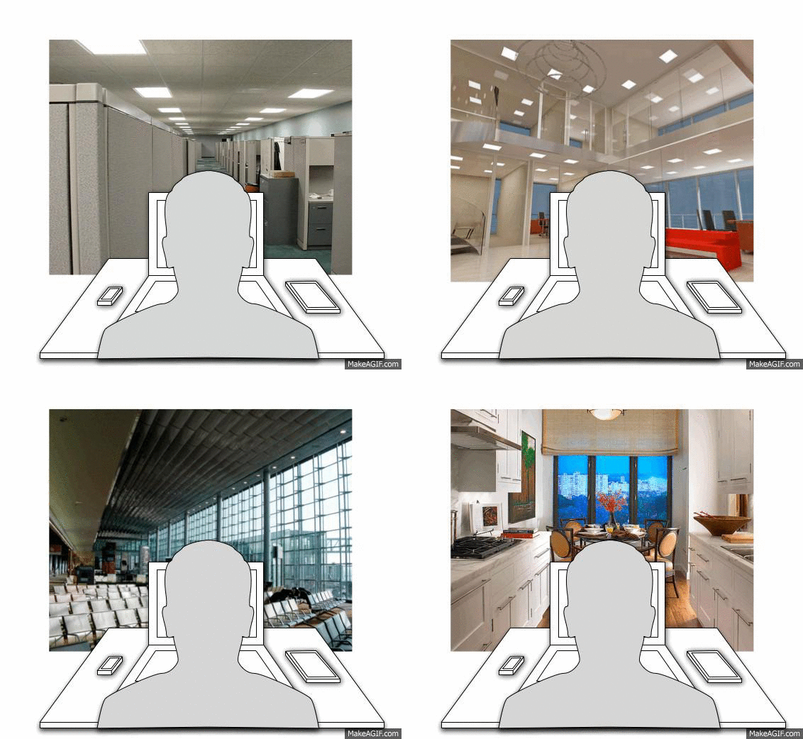
Whereas intranet management tends to focus on what’s happening in the browser, the digital workplace pulls the lens back to also take in the device that’s being used, where it’s being used, who’s using it, what time, what they’re eating. (Okay maybe not the latter. Although maybe. It’s all about context.). As showcased through the social network Somewhere, we are increasingly working in a variety of different ways. How does the digital workplace support and enable us? This is something that digital workplace management is focused on.
The top 5 secrets of intranet mega menu success
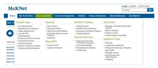
As we head into the home straight, in at number 12, we have another post from Lou Kennedy’s usability series, with a focus on the beauty that is the mega menu.
Lou talks us through a few benefits of this approach, such as the ability to clearly label groups of links and neatly show more navigation options to help users. We won’t give all her secrets away here, but this is one of the biggest ones: don’t just replicate your intranet’s navigation. This new, prime bit of real estate is a great opportunity to help users quickly and easily find key content, so don’t just throw in a sitemap and hope for the best.
12 success factors for working with SharePoint that aren’t about the technology
Although DWG is vendor-neutral, there’s no escaping the patriarch of contemporary intranets: SharePoint. Although there are plenty of other platforms and solutions out there, running around, growing up, graduating and starting families of their own, this daddy of platforms remains ubiquitous in any discussion about intranets. And like a patriarch, it can be rolled out sometimes unquestioningly, with all its gadgets, and not always listening to the needs of its people. But, if deployed correctly, it can also result in really helping those that use it.
Based on DWG’s research into SharePoint 2013, the slide deck embedded in our 13th most-read post is one that was presented by Nancy Goebel, our Managing Director of Strategic Partnerships and Business Development, at ALI’s “SharePoint for Internal Communications” conference back in May 2014. And although you miss out on listening to her live, seeing the story she told is still a useful read for anyone working with SharePoint.
The last social intranet strategy you will ever need
And finally – drum roll please – we have a post based on a research report written by yours truly, addressing the difficulties that many are facing in deploying social intranets.
The title of the post may be hyperbole, but in it we share an approach that should underpin any social intranet programme:
- Identify priorities and challenges.
- Align social technologies with business processes.
- Demonstrate value.
- Encourage leadership and adoption.
- Rinse and repeat.
And that’s a wrap!
We’re looking forward to getting on with 2015, and keeping the great insights and content coming for you. Our expert blog is driven by trends and needs we’re seeing amongst our members, clients and community, but if there’s anything in particular you’d like us to focus on then just drop us a line, via whichever medium becomes vogue this year/month.
Categorised in: Digital workplace, Intranets
