The top 5 secrets of intranet mega menu success
Intranet mega menus can make large amounts of information much more easily accessible, but they’re fraught with design and usability challenges. This article presents 5 expert tips for implementing intranet mega menus that are user friendly and effective.
“We’re thinking of implementing mega menus – do you have any tips or good practice examples?”
This is a question we’re often asked at DWG, so I thought I would share some tips from our intranet practitioners.
What is a mega menu?
A mega menu is an enlarged navigation menu that appears on rollover, often exposing more items than usual due to the increased space used.
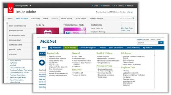
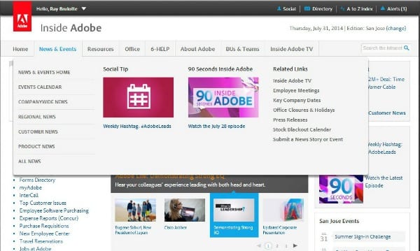
Here’s an example from Adobe:
What are the benefits of mega menus?
They can be used to show more options – neatly. And with clear labels so users can spot links more easily. You can also show these in one go on rollover rather than requiring users to click or use dreaded fly-out menus. Please tell me everyone’s ditched multi-level fly-out menus by now!
“In our previous design, there was an accordion on the home page that housed a lot of very useful links. By moving it into mega menus at the top of every page, employees can access these links much more easily.” Ray Brulotte, Adobe
Should I have a mega menu?
Mega menus are increasingly popular but, like all good trends, before you rush out and buy your own, you need to ask yourself some basic questions.
Rather than “Should I have a mega menu?” ask yourself: “How can I improve the experience for our users?”, “What usability problems do we need to solve?” and “What will achieve the most impact with our available resources?”
I would start with the premise of improving findability and see where that takes you… it might take you to working on search first.
How can I implement intranet mega menus well?
1. Be task focused
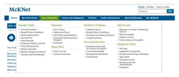
McKesson recently improved their mega menu with the addition of a ‘Popular Links’ section (See screenshot below – A). As with Adobe, this allows critical resources to be featured prominently and to be accessed at all times.
2. Set your rules
You’re creating prime real estate for your stakeholders here. So set the rules early. McKesson’s ‘Popular Links’ are driven by monthly site metrics reports and links need around 500+ clicks per month to qualify.
Make sure you regularly review search terms and metrics for mega menus so that you can continue to make improvements. Our practitioners are all checking their stats to make informed decisions regularly.
3. Make it clean and clutter free
Just because you have more space, this doesn’t mean you should fill it. Make sure you present a reasonable number of items, well labelled and with task-focused keywords.
The same good usability rules apply – you have the space, so no excuse for unexplained abbreviations and meaningless jargon. Keep it simple, both in design and in language.
4. Don’t be a slave to the structure
Mega menus don’t always follow conventional site structure. For example, you don’t have to show all the sub-navigation items for the next level down.
The goal is NOT to replicate your intranet structure. Your users don’t care for your carefully constructed intranet structure, neither do they wish to learn it. The point of a mega menu is to surface more links and deep dive users into the most important content and tasks, more quickly.
5. Test, test, test
Before you implement – make sure you validate with users. Adobe used card sorting to help them decide what to name each mega menu and to organize what went where. They have also conducted user testing since launch to make minor tweaks.
It’s not just the labels and categorization you need to worry about. The technical implementation is critical. Be mindful of how the rollover works. Make it too sensitive or too slow and it will annoy users. Does it get in the way of other critical links like the breadcrumb?
So, test the wording, test the categorization and test the interaction – as early as possible.
Still hungry for more?
Here are some other information sources on this topic:
- Mega menu live tour: DWG extranet (PRIVATE DWG members content)
- Good menu interaction by Amazon
- Mega menus gone wrong – NNg
Related research
User-centred design (UCD) for intranet navigations
Large corporate intranets serve diverse audiences and support multiple goals, but often they have evolved with little control, reaching mammoth proportions.
In this paper we set out the steps to developing an intranet information architecture (IA) using user-centred design (UCD) techniques, starting with why it is so hard to find an intuitive IA, and key success factors.
Categorised in: → Intranet homepage, → Intranet usability, → Search and findability, Content management