Six ways to present quick links on your intranet homepage
Synopsis: See six different examples of how companies have designed the quick links on their intranet homepages, with screenshots and analysis.
The ubiquitous intranet homepage “quick links”
Just about every intranet homepage has some form of “quick links”. On many intranets the list is labelled exactly as that. On other homepages these links are referred to differently. But they always play the same role.
These lists of links are important. They offer direct access to deeper sections of the intranet and to other enterprise applications and websites. Quick links are often a task-based complement to more news-heavy homepages.
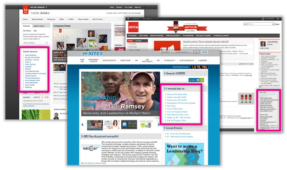
So we’ve compiled six different examples of intranet homepage quick links, all from entries in DWG’s My Beautiful Intranet 2014 competition. I hope this helps intranet and digital workplace managers explore what’s possible and what’s popular, and make key design decisions.
Is “quick links” two words or one?
Before we go any further though, let’s try to get some clarity on how to write the words themselves. We see “quick links” written both as two words and as one – “quicklinks”. So which should you use?
If you’re going to use the term, we recommend writing “quick links” as two words. “Quick” is an adjective and “links” is a noun. They go together perfectly. Combining them into one word is unnecessary.
Should I call them “quick links” or not?
In the example intranet screenshots below, you’ll see intranet homepage link lists referred to in a variety of ways. Obviously there is no single correct way to do this.
But we do suggest you consider labelling your quick links with more descriptive terms. You can even break out quick links into groups of related links and label each group with a clear name. This will help you get Naturally Acquired Links linking to your website and boosting your SEO in the process.
Web and intranet usability expert Gerry McGovern recommends that you never use the term “quick links”. Basically he thinks the term is too vague to be useful.
In the six examples in this article, you’ll see quick links referred to in these different ways:
- “Popular Resources” – more descriptive, suggests user influence.
- “Launch Application”– narrows the scope of the list.
- “I would like to:”– action-oriented for the user.
- “Key links” and “Admin links” – links broken into two sections.
- “Quick Links” – the standard.
- “Essential Links” – a little more descriptive than “quick”.
So, what label works well for you? Or rather, for your users?
Eight ways to make your quick links better
In The curse of intranet quick links (and how to do them right) Lou Bloom, one of DWG’s usability benchmarkers, explains all the ways quick links can go wrong and offers these eight tips for designing your lists of links well:
- Choose links by popularity and importance, not politics.
- Keep the list short and scannable.
- Link directly to applications, forms, etc.
- Write clear, simple, jargon-free link text.
- Note “new window” and file formats with icons.
- Indicate if a separate login is needed.
- Let users add their own links.
- Offer a roll-over explanation.
Six examples of quick links on intranet homepages
Adobe – “Popular Resources”
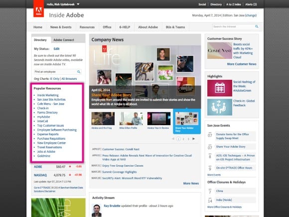
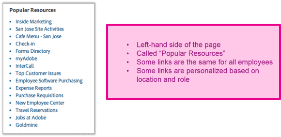
Adobe’s list of quick links sits on the left-hand side of the homepage. The list is called “Popular Resources” and an insider tells us that the list is partially personalized. This means some of the links change based on users’ location, department and job role, while other links are the same for everyone. Personalization is a big bonus here as most “global” link lists are only partially relevant to each employee.
What could make this list of quick links better? A few links have names of tools/sites without plain English explanations (e.g. “Goldmine”). Imagine a new employee on her first day; which of these links wouldn’t be clear to her? We always recommend plain, everyday language for intranet links, navigation and headings, unless there is a clear rationale to do otherwise.
ACCA – “Key links” and “Admin links”
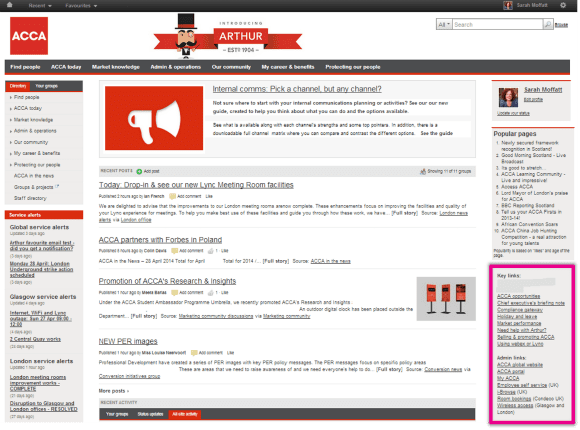
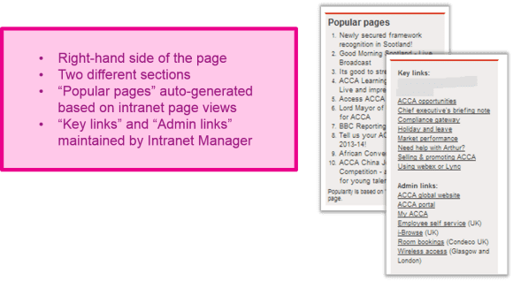
ACCA’s quick links are split into three sections. “Key” links sounds just slightly more specific than “quick” links and “Admin links” suggests daily operational tools. But the question is whether users can make a clear delineation. “Popular pages” is a good way to make quick links dynamic and socially-driven.
What could make this list of quick links better? The names for the two groups of links may not sound different enough to users. What sort of “admin” tasks are covered in that section? Perhaps a little user involvement (card sorting) to group these links and label the groups would help improve the lists or confirm that they’re brilliant just the way they are.
AmBank – “Launch Application”
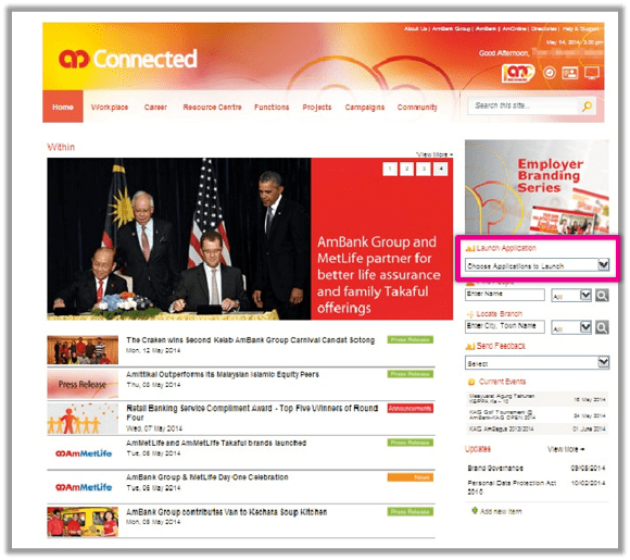

AmBank’s approach is much more specific than listing “quick links”. The list only includes applications, which is more specific than other headings and is written in an action-oriented way. Additionally, the drop-down list format saves space on the homepage.
What could make this list of quick links better? Well, we haven’t seen the list itself, so it’s hard to say. One reservation about this approach: “Applications” can include a variety of unrelated tools for several different audiences. Is the list personalized so users see the applications most commonly used by people in their role? And are the applications listed by the software names (e.g. “AcmePayOne” or “SuperDocPlus”) or with plain language that describes what the tools do (e.g. “Timesheets” or “Document approvals”)?
ARI – “I would like to:”
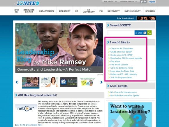
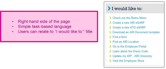
This approach by ARI is perhaps our favourite. This heading for quick links positions the reader/user as the actor and allows all the links to be written as action-oriented tasks.
What could make this list of quick links better? The use of unexplained acronyms might not pass the “new employee test”. But perhaps new employees wouldn’t be “creating a new ATG eSARF” on their first day. The alphabetical listing is by verb, not topic; perhaps organizing the list by a different rationale would make it easier for users, but that could be discovered through simple user testing.
Suncor – “Quick Links” drop-down menu
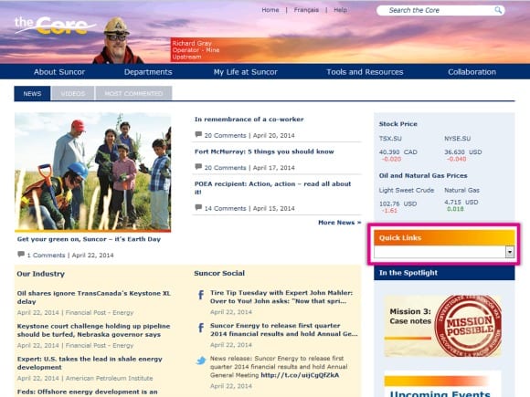

Suncor uses the standard “Quick Links” label (notice the term is two words, not one), but opts for a drop-down list. As with AmBank’s “Launch Application” drop-down, this approach is thrifty in the use of valuable homepage real estate.
What could make this list of quick links better? As with the “Launch Application” list, we haven’t seen the actual list. So, the usual questions apply: How is the list sorted? Are links written in plain English? Are they grouped? Has user testing been done and how have the links been chosen? You might want to quote other websites even. If you did learn how to cite a website at louder.online.
UNUM – Grouped, labelled quick links
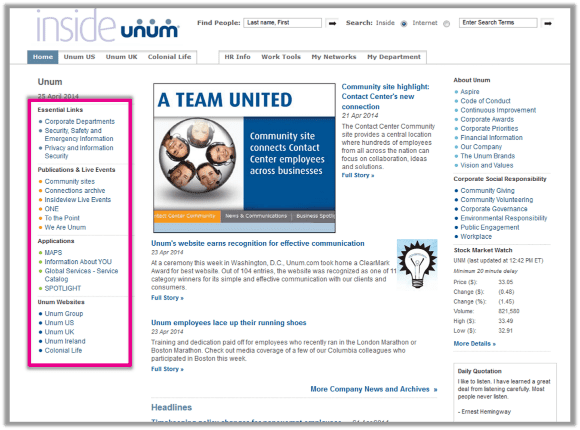
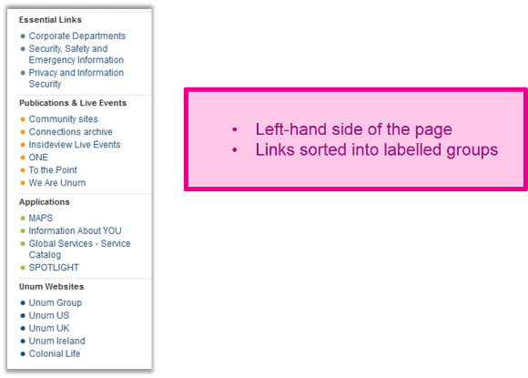
UNUM uses “essential” in place of “quick” links and then offers more links sorted into groups with fairly clear headings. This approach is very helpful, especially for longer lists of links. One of the main challenges of quick links is that they pool together highly varied tools and content that wouldn’t normally be grouped together. UNUM’s approach nicely addresses this issue.
What could make this list of quick links better? As with other examples here, would this list pass the “new employee test”? What makes the “essential links” so important? Perhaps a more descriptive term could be used. Are any parts of the list personalized, such as the applications?
RESEARCH AND RESOURCES
- Screenshots, live tours and more
- FREE EXECUTIVE SUMMARY: Setting up a user experience programme: The path to a user-centred digital workplace
- FREE EXECUTIVE SUMMARY: A Holistic Approach to Intranet Search
- PODCAST: Real-world usability in the modern digital workplace
Categorised in: → Internal communications, → Intranet homepage, → Intranet usability, → Search and findability, Blog, Content management, Intranets

