10 examples of bringing social onto the intranet homepage
See 10 different examples of how companies are bringing “social” to their intranet homepages, with screenshots and analysis.
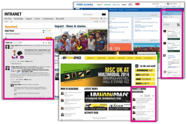
As a Community Manager for DWG, I’m incredibly privileged to have the opportunity to speak to many people across the intranet and digital workplace profession about what they’re working on, the challenges they’re facing and their successes. There are always some great stories, as well as some familiar ones that induce flashbacks to my former life leading a social intranet project.
The spread of “social”
Anecdotally, a large number of people I’ve spoken to recently seem to be seriously turning their thoughts to how they can make better use of social technology within their organizations. This will normally be either as part of a new initiative or to make the most out of what they already have in place.
This doesn’t come as a surprise. The survey we carried out as part of our Successful Social Intranets research revealed that:
- 27% of respondents were in the development, planning or pilot stage of implementing a social intranet
- 23% were “getting there”, with partial roll-out
- 35% had fully deployed their social intranet but had it in place for less than 2 years.
What is “social”?
A ThoughtFarmer blog post entitled What is a social intranet? explains “social” to simply mean “people interacting with each other”. Adding the word “social” to the word “intranet” means the intranet’s features enable interaction between users, not just interaction with content (i.e. reading it or filling in forms).
At a user experience level, when we talk about social intranets we’re talking about giving users agency. One of the benefits of a social intranet is that it allows the user to move beyond being a passive receiver of content. Instead, it can help them become an active player with choices and the ability to participate.
What does this actually mean? At its best, a social intranet can support a magnitude of people-centred practices, such as: the flow of information and knowledge; more effective working; feeling a part of your organization; being informed; having a voice.
The way in which that agency and those choices manifest themselves will depend largely on the business’s priorities, how the organization wants to support (and shape) the way people work, and the corporate culture.
There’s a huge underlying message to this, which can’t be repeated often enough: organizations shouldn’t be switching on social just to keep up with the cool kids. Rather, they should be using social to support how they want people to interact with each other and with the business.
The changing face of the intranet
There’s a related trend to the advent of social: the changing face of the intranet homepage. Planning an Intranet solution for your business may not come easy, if you don’t know where to start. But just like with anything you are unfamiliar with, it always helps to go a quick internet search, just so you at least have a basic understanding.
There are so many different ways of integrating social activity and content to that homepage. Some of these can radically change how that real estate is used; for example, through multiple and detailed activity streams. Others equate to subtle “nudges” that can help encourage usage of particular social tools, such as the ability to update your status.
The different options to bring social to your intranet homepage arguably break down into two main (if simplified) categories, both of which are rooted in how you’re trying to help the user:
- helping users discover content and information that’s relevant to them
- helping users create their own content, in order to participate.
How do you go about executing these two concepts? Based on entries to My Beautiful Intranet 2014, here are some ideas to get you started.
10 ways to bring social onto your intranet homepage
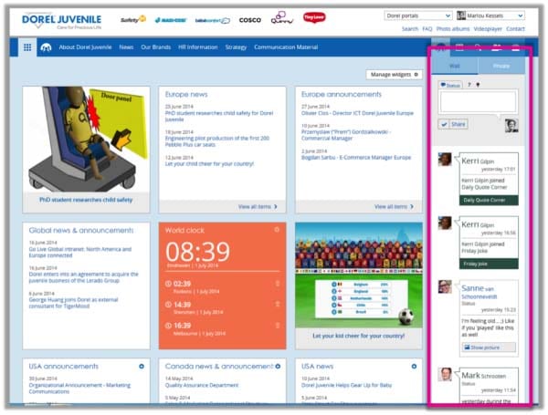
Dorel Juvenile: Persistent right-hand column

- Action-oriented right-hand column
- Persistent throughout intranet
- Lets users keep up with conversations without returning to a dashboard page over and over
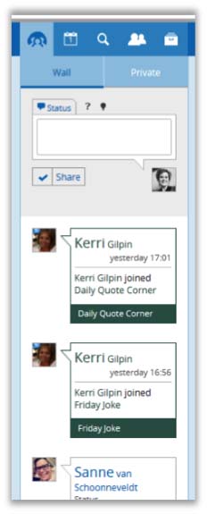
Dorel Juvenile’s intranet makes use of a drop-down right-hand column that is persistent throughout the site. In that column, users have access to an activity stream of recent updates, as well as the ability to share their own status, question or idea.
What could make this better? While an innovative concept, the right-hand column seems a little decorative. Each update takes up a lot of space, making only the four most recent updates (assuming they’re short posts) visible in the screenshot. This could make it difficult to follow a busy stream. We recommend changes to the sizes and layouts of the “wall” column, which could include an option to expand and collapse individual posts to make more content visible.

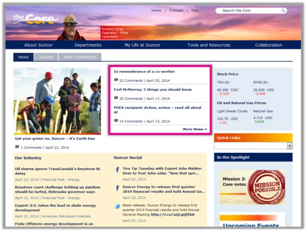
Suncor: Number of comments for news stories

- Shows popularity of articles
- Popularity or “social recommendation” as big a draw as articles themselves
- Compels users to read the story
- Implies and invites more participation

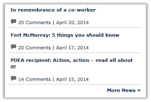
Suncor has opted for the simple “nudge” of showing the number of comments per news story. This has the effect of providing an increased incentive beyond the headline to read the story: What are people discussing?
What could make this better? With only article titles, the number of comments and the date, this list of news items is quite sparse. To give readers more context and increase clicks we recommend providing a few lines of teaser text for each article. Additionally, allowing users to “like” or rate articles could encourage participation for those who do not wish to leave a comment but have found the content useful.
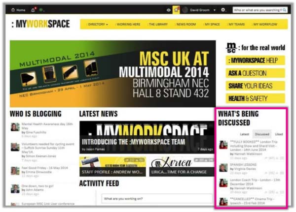
Mediterranean Shipping Company:
Sort news by most discussed and liked
- Sorts by most popular news/discussions
- Sorts by comments or “likes”
- Surfaces what people are interested in
- Invites participation
- A good complement to chronological and more official news

The tabbed box on Mediterranean Shipping Company’s intranet will be familiar to many readers of news sites. It provides an automated list of popular content based on users’ interaction with articles and discussions. This can help bubble up content to users that they may not have otherwise known about and shows that there are people participating in discussions across the platform.
What could make this better? Include where the discussion is taking place. For example, is it within a particular community, is it from the “Newsroom” or a status update? This can help provide additional context as to the relevance of the discussion to the user.
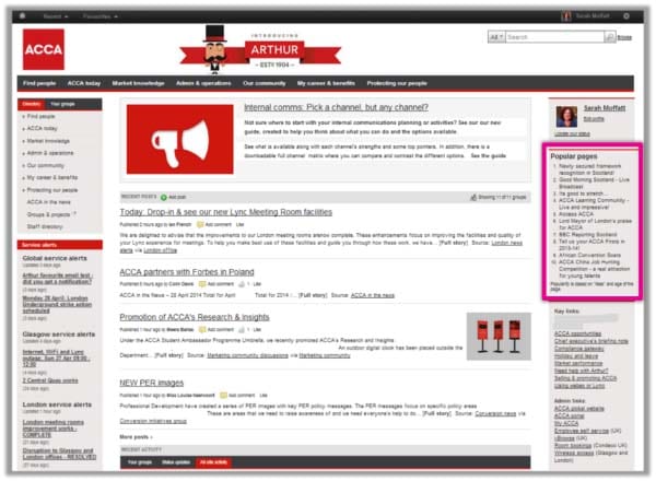
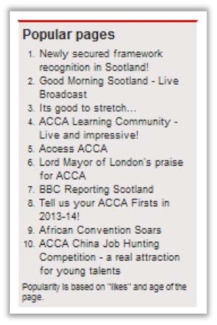
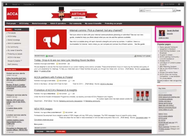
ACCA: Popular pages

- Simple way to surface popular news
- Includes news from all locations
- Popularity based on “likes” and age of pages
- “Social” because generated by user behaviour
ACCA has a mixture of different social elements on its homepage, but the one highlighted here is “Popular pages”. While at first glance this may not look like typical “social content”, the small print shows that popularity is based on “likes” and the age of the page. In other words, it’s helping users discover what their colleagues are using on the site.

What could make this better? The links seem to be to articles as opposed to information pages, meaning the title “Popular pages” should be updated to a more accurate title, such as “Popular news” or “Popular content”. If the list highlights both pages and news, it would also be useful to include additional information for each link about the type of content (for example, whether it’s news or a page), as well as how many “likes” it has received and the age of the content.
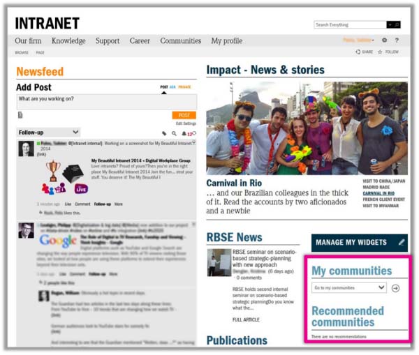
Roland Berger: Link to “My Communities”

- Drop-down list to select a community
- Offers alternate route to site navigation
- Personalized list makes homepage relevant
- Recommendations invite further involvement
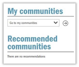
Here’s a simple but effective way to encourage usage of communities and groups: simply list those the user belongs to! Roland Berger has adopted this, along with a few other social elements, on the homepage. This can help users quickly navigate to their groups, solving an issue that some face in not being able to easily access communities of which they are a member.

At DWG we see so many intranets, especially ones based on SharePoint, that keep the “social” and “community” content completely separate from the rest of the intranet. This simple tie-in can go a long way.
What could make this better? In the screenshot provided, the user has no recommended communities. To improve the “Discovery” element of this feature, this section should provide some guidance around what the user can do to receive recommendations or perhaps highlight some newly created or recently updated communities when a recommendation isn’t available.
Roland Berger: Well-formatted social feed

- Simple, well-spaced format
- Easy to scan and read
- Actions and actors stand out
- “Follow up” filter elevates utility of social to be an active task list

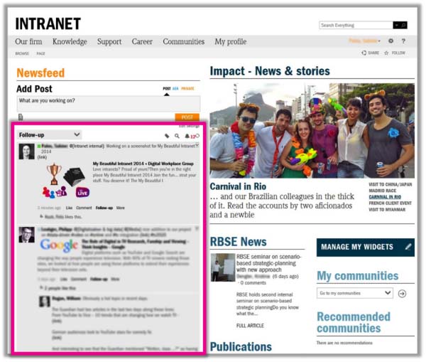
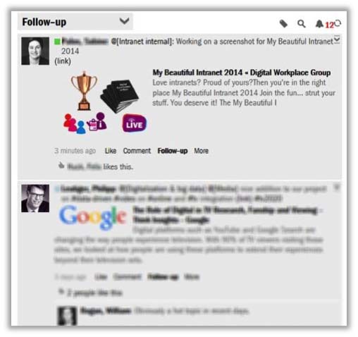
Here’s another social feature from Roland Berger, this time focusing on an activity stream. Far from just being a way of seeing new content, this well-formatted stream provides useful information around the content, such as a preview of links shared, the ability to mark a post to “Follow-up”, as well as ways to interact with it from within the stream itself. The latter encourages participation beyond simply reading other people’s posts.
What could make this better? The Newsfeed appears to be comprised of status updates and conversation. In order to make it even more useful, it could add activity from communities, perhaps with an additional filter to allow the user to see updates either from within their network or from their communities.
Adobe: Allow status updates

- Simple option to participate
- Invites status updates at start of day
- High up on homepage for easy access

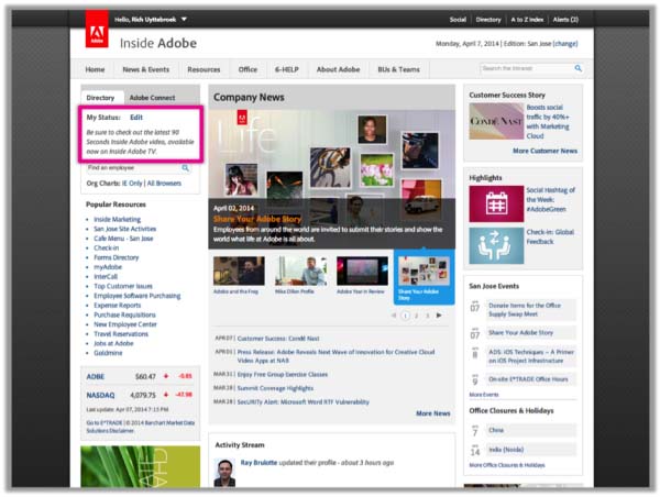
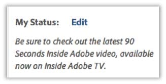
Similar to the other examples, Adobe’s homepage makes use of a number of different ways of integrating social. The simple “nudge” highlighted here, however, is designed to encourage users to quickly and easily share what they’re working on—a simple check-in at the start of the day or whenever they find themselves on the intranet.
What could make this better? While the ability to update your status from the homepage is useful, this feature seems out of context alone at the top of the page. In some cases intranet status updates just show up atop users’ profile pages. In other instances they go to the whole company feed or can be targeted to specific groups. We recommend adding indicators to this status box to explain the target location and audience for the update.
Quality Practice: Showing social activity feed

- Personalized social activity feed
- Shows only posts from a user’s network
- Relevant, work-related social updates

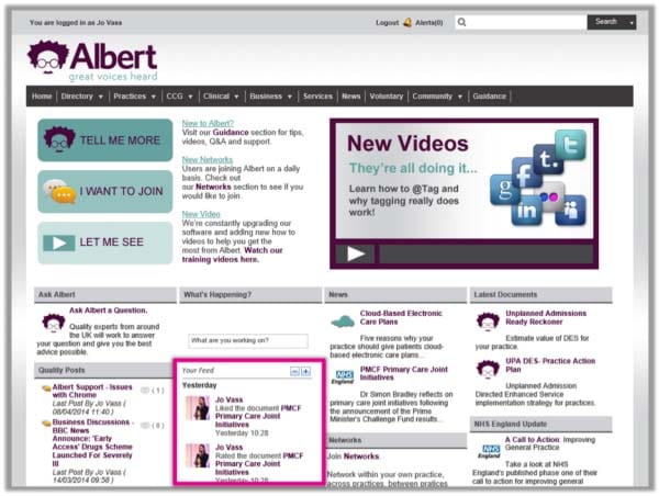
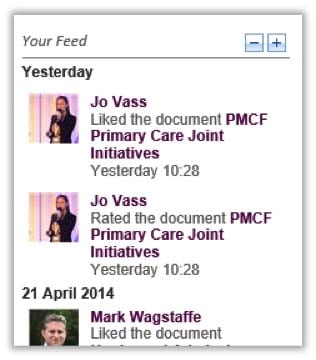
Activity streams come in different shapes and sizes, ranging from fully integrated streams of conversation, interaction and notifications, to more simple ways of surfacing activity. Quality Practice’s “Your Feed” provides a simple way of seeing what people within a user’s network are interacting with around the site, helping them discover useful content. Narrowing the scope to a user’s network, rather than the whole company, greatly increases the personalization.
What could make this better? It would be useful to see which section of the intranet activity is taking place in, such as whether it’s within a community, within a particular business section’s pages, or from the news.
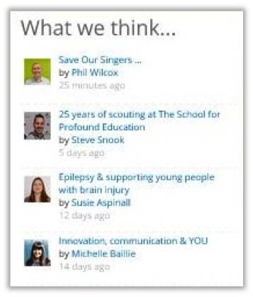
Children’s Trust: List blogs with authors’ images

- Highlights user-generated posts
- Richer content than just discussions
- Author images bring the posts to life
- Clean and simple design
- Links to author profile pages enable connections with thought leaders

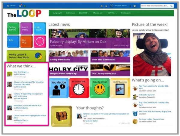
Blog posts can be a useful way of allowing users to share their expertise, thoughts and stories, supplementing more traditional corporate news. The Children’s Trust shows the latest blog posts on its homepage, combined with an image of and links to the author. This can encourage people to build their own personal brand within the organization and also supports internal networking.
What could make this better? To encourage readership of the posts, it would be useful to include data such as number of “likes” and comments. If tagging is available, showing relevant tags could also help users see the key topics that blogposts are related to.
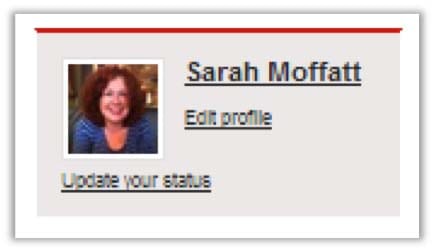
ACCA: Include link to edit profile

- Makes homepage feel personal
- Allows quick access to own profile
- Update profile with one click
- Increases chances of adoption

One of the areas in which organizations struggle is encouraging completion of a profile. The provision of an “Edit” link directly on ACCA’s homepage acts as “nudge” to keep the profile up to date, while also serving to make the homepage feel more personal.
What could make this better? In order to further encourage users to keep their profiles up to date, it would be useful to include information on when they last edited the page. For example, seeing that your profile hasn’t been updated in over a year may act as a prompt to review the information that others are seeing about you.
It all comes back to the user
Ultimately, when it comes to looking at how you can integrate social tools and activity into your intranet homepage, you need to start with what it is you’re trying to achieve and what will be useful to users.
- Are you trying to help users discover content that is relevant to them?Then features such as activity streams covering content such as status updates, new posts, comments, edited pages and interactions, or lists of popular content, can help.
- Are you trying to help users participate and create their own content?Then provide interactive tools directly on the homepage, such as commenting, liking, creating status updates and uploading documents.
- Are you going for a fully socialized site?Then go one step further and blend both approaches to allow users to simultaneously share their own voice and see what others are saying and doing.
The choice as to whether or not the user makes use of the tools will be dependent on a whole host of other factors, such as your efforts at encouraging adoption and whether usage is mandatory or voluntary. But you can help to show the choices available to them by bringing the highlights to the homepage.
[one_half]
[/one_half] [one_half_last]
[/one_half_last]
See Also
- Why a social intranet needs to be both voluntary and mandatory
- Social intranet strategy
- New DWG research reveals 6 ways to encourage adoption of a social intranet
Categorised in: → Intranet homepage, → Social intranet, Intranets
