10 amazing live intranet and digital workplace tours from 20 years of DWG
One of the most valued elements of DWG membership has always been access to the live tours of intranets, digital workplaces, and related tools and channels that we regularly run. Whether at our in-person member meetings or on our various online webinars, the ability to take a detailed dive into intranets and other platforms that would otherwise remain private and behind the firewall provides highly valuable insights for digital workplace teams.
Occasionally over the past 20 years, we’ve also been able to open up these exclusive tours to a wider audience, for example through our DWG Institute Technology Exchanges or innovative 24-hour DWG24 events. In the latter, when we were planning the content, our mantra was always that the ‘live tours’ were the ‘stars’ of the show. We recognized that these were what made people sign-up; an opportunity to glimpse under the hood at the intranets and digital workplaces of some of the world’s leading organizations.
For the past decade or so I’ve been in the lucky position of writing up notes on many of these tours. It’s one of the things I love about my role at DWG – the opportunity to see some truly great intranets and digital workplaces.
Bearing this in mind, I was asked to write a post about my favourite tours from the past 20 years as part of DWG’s birthday celebrations. This has been a difficult task – there have been LOADS! To make it easier, I recalled an article that Paul Miller wrote back in June 2012 when DWG (then still the Intranet Benchmarking Forum) was just turning 10 years old. His piece showcased 10 intranets that had defined the industry up until then, all of which we had featured in a live tour of some sort.
Taking that as the starting point, here is my attempt at a follow-up, looking at 10 more amazing live intranet and digital workplace tours from the past decade.
1. Oxfam International and Workplace’s cultural impact
In 2019, global NGO Oxfam International gave a compelling live tour of its instance of Workplace from Facebook and talked about the impact this had made. For me, this was a powerful insight into how enterprise social networks can influence organizational culture, improve processes and break down siloes. Oxfam International is an inherently complex organization – it is actually a network of different organizations, with a presence in multiple countries, across an extremely diverse workforce using multiple languages.
What Workplace had brought was the ability for everybody to interact across geographies as well as hierarchies; machine translation had had a particularly powerful impact, meaning that people felt able to post in their first language. The fact that their place in the organizational hierarchy wasn’t displayed on Workplace further meant that people at all levels felt more comfortable in posting. Creating a truly social layer and removing some of the associated barriers was encouraging people to use the platform to solve problems and improve different collaborative processes. It really felt as though the digital workplace had been a gamechanger.
Related resources
- DWG members: Read the session notes in full
- Podcast:
2. Verizon’s deeply integrated HR portal
US communications and media company Verizon’s early HR portal ‘About You’ was a pioneering example of integrating information from a plethora of different HR systems into the intranet to create a single, 360-degree dashboard of all the information and links an employee needs to manage their HR journey. In 2014, several years before most of us were talking about ‘employee experience’, the About You team were showing us a live tour of their HR intranet, which included information on pay and benefits, performance and recognition, discounts, learning, paid time off, career progression, and much more, largely driven by integrations with other systems. There was a similar view for managers too. The amount of information on the dashboard is actually quite mind-boggling and required extensive use of tabbing.
Perhaps without realizing it, they had created the kind of user-centric, personalized portal and digital employee experience that many organizations are still striving to create today; a single place to go for all their employees’ needs (at least in terms of HR), limiting the requirement to go into backend systems, helping to save time and drive productivity. An intranet that was well ahead of its time.
Related resources
- DWG members: Read the session notes in full
3. Google’s intranet that looks very much like Google
DWG24 – or formerly Digital Workplace 24 and, even further back, IBF24 – was a ground-breaking 24-hour online festival that featured numerous live tours of the world’s intranets and digital workplaces. Just as if we were organizing Glastonbury, we’d always try to get some ‘headline’ acts from well-known global brands to draw people to the event. One year we were lucky enough to get Google to show us its then intranet, ‘MOMA’, which was an exciting and intriguing opportunity to peek behind the curtain at one of the world’s most iconic technology companies.
When MOMA was revealed, there was a surprise that actually wasn’t really a surprise at all… the home page of MOMA (although purists might argue whether it actually is a homepage) was revealed to be just a Google search box. In fact, MOMA felt pretty much like using Google, with content from MOMA returned very much within the Google experience of search and using the Google suite of apps. If I remember correctly, there were a few neat innovations on show, but ultimately MOMA stretched the concept of what an intranet actually is and demonstrated how you can put search at the heart of the experience.
4. Adobe’s stylish campus mobile app that supports hybrid working
In 2021, Adobe picked up DWG’s ‘Digital Workplace of the Year’ Award due to its continuing excellent work across multiple aspects of the digital workplace, including the creation of a new mobile campus app that helps employees navigate around different Adobe offices worldwide. In January 2022, we were lucky enough to get a live tour of this app.
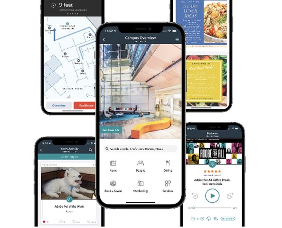
As you might expect from a company with such a well-established design culture as Adobe, this is a very attractive app with a strong user experience. However, it also has rich features, such as integrated wayfinding, meeting and desk room booking, intelligently architected around user journeys, as well as the ability to add other campus-specific transactions powered by integrations with other systems. Adobe has also created an extra ‘virtual campus’ for people working from home and added lots of wellbeing related content. To me this is an app which is focused on supporting hybrid working and sets a standard for 2022.
Related resources
5. Barclays Bank’s mobile app for frontline staff
In the early part of the last decade, progress on creating mobile apps designed to help frontline staff access digital communications and content was pretty slow, and good examples were few and far between. Then, in 2013, Barclays Bank released ‘MyZone’, a mobile app aimed at customer-facing staff in the bank’s retail outlets that could be added to their own personal mobile devices.
Created by the bank’s Frontline Help team, MyZone more or less redefined what you could do with an employee app, offering a very wide scope that included access to news, product and process information, learning, HR information, ideation, videos, engagement-led communications, and more. Perhaps most significantly, it also provided access to communities meaning you could ask your colleagues questions.
What made MyZone so exciting was not only that you could do so much within one app, but also that it was having a real impact, with great levels of adoption and contributing to better employee engagement and customer service. The app is no longer around today, but it set an early standard on how to deliver frontline communications in a mobile environment and raised the bar on what could be achieved.
Related resources
- Podcast:
6. Royal Mail’s innovative open intranet
The UK’s Royal Mail was formerly the public sector organization responsible for the delivery of mail and parcels in the UK, although it has since been privatized. Its employee intranet – entitled ‘My Royal Mail’ – raised a few eyebrows because it was more or less a completely open intranet, available to view on the internet. This unusual move removed barriers to intranet access for the company’s huge frontline workforce at a time when mobile intranets were less mature than they are now.
While some other companies have produced similarly ‘open’ or partly open intranets, few have been as extensive as My Royal Mail, with operational information, news, videos, and more. Clearly not everything was open – discussion boards for example required authentication – but there was a surprising level of transparency in the content.
You can actually still view My Royal Mail but it’s been scaled back, with news moved on to Workplace and an app, although there is still lots of useful operational information there. Personally, I think having an open intranet still provides an opportunity to distribute information to companies with large frontline workforces in industries such as travel, hospitality and retail.
7. Walmart One: one of the largest intranets in the world
We’ve featured retailing giant Walmart’s associate intranet on two occasions – once in an edition of Digital Workplace Live and the other time in a DWG Institute Technology Exchange, which is available for all to watch. One of the most striking things about ‘Walmart One’ is its sheer scale; it’s accessed by more than 2 million associates around the world, making it potentially one of the largest commercially deployed intranets in the world.
Walmart One is also an excellent intranet, with content and experiences firmly wrapped around the needs of employees, complete with content targeting, rich media, high-value integration of other digital workplace systems such as scheduling tools, and more. Behind the scenes there’s a range of strong intranet management practices going on too, including using analytics to drive improvement. Pulling that off on any intranet is great, doing it for more than 2 million associates is exceptional.
Related resources
- Podcast: Walmart – Inside (probably) the world’s biggest intranet
- Event recording:
8. Liberty Mutual’s next generation intranet toolbar
Back in 2018, when US financial services company Liberty Mutual first revealed the toolbar on its intranet, which centralized notifications, reminders, transactional capabilities and HR-related tasks from a plethora of different organizational systems, it was a genuine ‘wow’ moment. Up until then, very few had delivered what many had been talking about in theory, but here was the intranet providing a consistent employee experience and reducing the need for employees to visit multiple systems. This helped to drive productivity, reduced frustration and massively inflated the value of the intranet. Over time, more features such as a chatbot were added.
Realizing they had a genuinely innovative piece of technology on their hands, the Liberty Mutual team then productized the toolbar, set up a separate company called Workgrid, and the rest is history. We’ve featured Workgrid and Liberty Mutual numerous times, including in this DWG Institute Technology Exchange.
Related resources
- Event recording:
9. Duke Energy’s continually improving intranet
Over the past decade, we’ve featured Duke Energy’s intranet ‘The Portal’ at least five times, on each occasion showing something different or new that’s been worked on. It’s also won a Nielsen Norman top 10 intranet award twice, a Step Two award, and other awards too.
And why does it keep on appearing? Because Duke Energy’s intranet is an exceptionally well-managed platform with strong design principles, robust governance – and the odd innovation here and there too. As somebody who is admittedly pretty nerdy when it comes to intranet design and management, The Portal is one of my favourite intranets. In the most recent session, in late 2021, Martha Brown and her team showed us some great content design evident in a new hub focused on areas of HR, as well as some innovative approaches to supporting and training site managers to drive a sustainable, devolved publishing model. Many intranets tend to fall apart over time, but Duke Energy’s Portal continually and incrementally improves in terms of content, design, features and management processes.
Related resources
- DWG members: Read the session notes in full
- Podcast:
10. San Diego Humane Society’s brilliant intranet branding
Back in 2012, we featured a live tour of the intranet from the non-profit San Diego Humane Society, which helps to advance the welfare of animals through a range of services and activities. The intranet was not only very good, but also has my favourite name of any intranet so far. ‘Fetch’conveys both the action of retrieving information and content – a critical activity for any good intranet – but also what you would say to your pet dog. A banner with a dog chasing a bouncing ball helped to position the intranet as a channel aligned to the organization’s culture and activities, but also subtly to present it as a useful, friendly and loyal companion to help you with your working day.
Talk to us about…
… becoming a DWG memberMore about DWG Membership » |
Categorised in: Digital workplace, Intranets
