We finally found the world’s best intranet
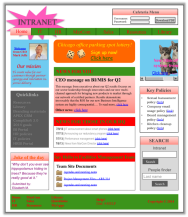
Synopsis: As with the Loch Ness Monster and Bigfoot, we always assumed the perfect intranet was a myth. But now we’ve found the world’s best intranet and have created annotated intranet screenshots explaining its many strengths.
What does the best intranet in the world look like?
And what makes it so great?
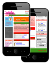
From a thoughtfully designed global navigation to creative use of colours and imagery, this intranet is simply amazing. Oh, did we mention how it renders on mobile devices?
The obvious strengths of this intranet are simply undeniable. But in honour of aspiration and competition we might as well still ask, do you think your intranet is any better?
Announcing My Beautiful Intranet 2014
Love intranets? Proud of yours?
Think you can beat the world’s best intranet? Submit your intranet screenshots to the My Beautiful Intranet Competition 2014. Vote for your favourites. Celebrate your hard work and that of the rest of our global intranet community.
[one_half]
Intranet contest
For intranet design and features

[/one_half][one_half_last]
Mobile contest
For mobile intranets and apps

[/one_half_last]
Categorised in: → Employee mobile, → Intranet usability, → Search and findability
