Enterprise mobility or mobile intranet?
Smartphones have made us focus on the devices themselves and it is natural to want to get the intranet onto them. But that perspective can be just as backwards as picking SharePoint and then figuring out what the intranet’s actual requirements are.
I’d like to suggest that we should consider the idea of mobility being more important than merely “mobile”.
Enterprise mobility: baby steps
We are through, I think, the first stuttering steps of what we can vaguely call “Enterprise mobility”. Voice has been mobile for as long as anyone cares to remember, email and calendaring are uniformly available, but access to services that have traditionally been centred on an organization’s intranet for communication, information provision, collaboration and transaction are for the most part only nibbled at by typical organizations. The ability of most individuals to choose where they work is far from a right.
There are some significant enterprise exceptions (see the 2013 Intranet Innovation Award winners), some out-of-the-box usage of cloud-based mobile interfaces such as Yammer, and some lashed-up solutions layered on top of existing infrastructure (GOOD, KWizCom etc) but the intranet tends to stay pretty sedentary. The fact that the good stuff is still seen as innovative in 2014 gives you some indication of where we are.
The digital workplace must serve discrete tasks
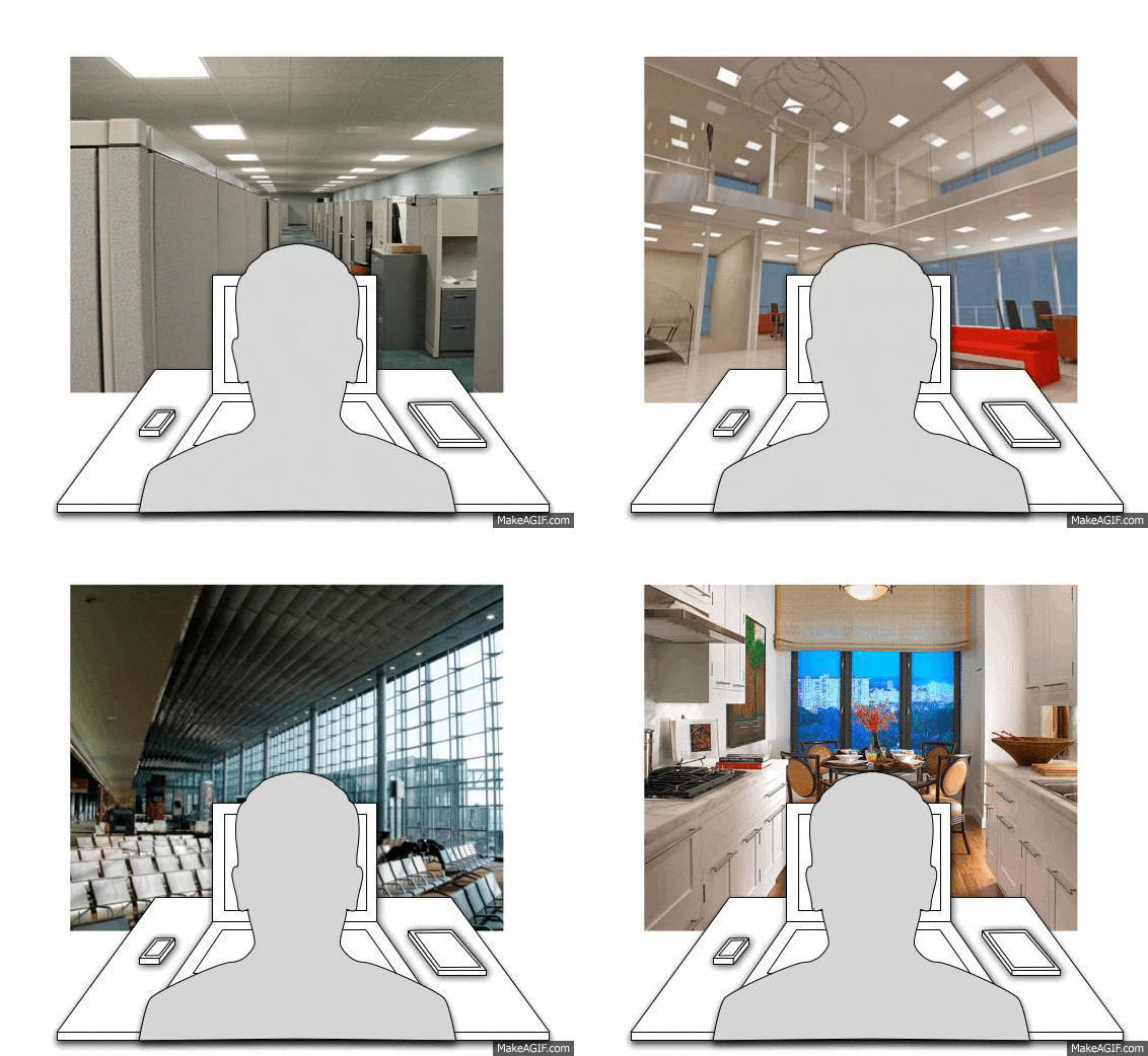
A couple of posts ago I talked about the change in perspective that is required to move from an intranet to a digital workplace way of thinking. We need to step back from the screen and hover behind the ear of the user as they consider their choice of device (say laptop PC, tablet or smartphone) against the task they want to achieve matched with the environment they are in at the time.

Let’s continue this thinking. As we lurk behind one of your colleagues, a “digital hierarchy of needs” is formed between the task he or she is thinking about at that moment. Their task may be substantial, such as “I need to get consensus on the company’s expansion into China”. This is interpreted in the moment, broken down into dozens of micro-tasks, many of which may be a series of little digital interactions related to an immediate next step, such as: “write an agenda [SharePoint]; book a meeting room [room booking system]; send invitations for the meeting [Outlook].” There is no “Form consensus on the company’s expansion into China” button on the intranet. Your colleague is in the flow of their own working life.
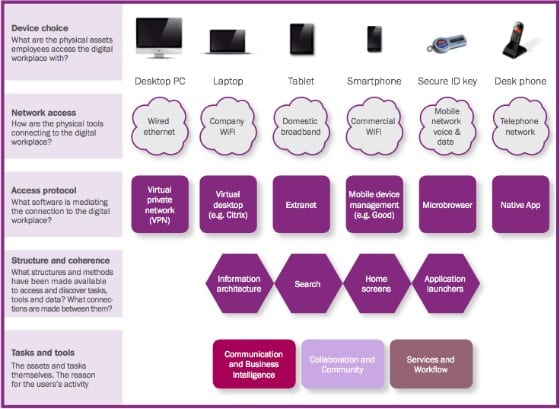
The choice of device is the first step to achieving those micro-tasks. Your colleague, if out and about, needs to consider if and how they will access a network, such as looking for wifi. There might be different protocols to access secure data such as firing up a VPN connection. Once they are connected, they must then find the way to complete their task by locating it within a structure, say looking for the right service on the intranet.
When they finally get to the task and the content or functionality that might solve one piece of their puzzle, the laws of usability and user experience still apply. It still has to work. I met up with a colleague last week in a London caf̩. An email arrived (on his iPhone) and he needed to send someone a document. I watched as he stepped up from his iPhone to his iPad and finally to his Mac laptop. He struggled to get enough bandwidth provided by tethering to his phone, so he moved onto the caf̩ Cloud wifi network, having to remember his username and password and sign-on to finally get the document to its recipient. This document was important and it had to be done that minute, otherwise he would have given up Рthere was probably aggressive muttering firmly grounded in robust Anglo-Saxon.
Here’s how I summarized this stack in the DWG report Digital workplace user experience:

The three constraints of mobility
The moral of this story is that the user’s goodwill along this path is fragile. At any point they might be foiled by insufficient bandwidth, a dropped connection or forgetting a password.
And that’s just the technical side; again let’s step back and consider context – people exist in the physical and social world. When you are on a train, in a cafe, airport, aeroplane, meeting room or even at your desk, you are constrained in three different ways:
1. Digitally
- Bandwidth and connectivity
- Power and battery life
- Screen size
- Latency (can I get started on my tasks quickly?)
- Input speed
2. Physically
- Comfort (and will working in a certain way cause discomfort)
- Space to work (elbow room)
- Freedom of movement (getting in and out and getting access to your things, bags or pockets)
3. Socially
- Noise (both coming from others, and caused by the user)
- Privacy (can I complete this work in public without betraying confidences?)
- Self-consciousness (will doing that embarrass me, or put my personal safety at risk?)
Each of these plays its part in a user’s choice of task, and about whether that moment is the right moment. It is getting into that perspective that I believe will lead organizations to make the right choices about enterprise mobility:
- Understand the user’s environment and context
- Understand that not all of the devices and services are appropriate for all contexts
- Understand that the mobile experience is especially fragile and work out how to fix it where necessary.
Digital workplace manager’s role: mitigate fragility
To my mind it is the digital workplace manager’s role to mitigate this fragility by making sure that the little tasks strung together are all achieved, so that the big tasks happen. I’m not suggesting that every tiny mobile experience and behaviour needs to be mapped out in detail – this isn’t rocket science, it is just a change of perspective. But it is important to have a holistic view of how people behave when out of the office, and to know that this is normal and not a weird exception.
Orient your perspective towards “mobility”, not “mobile” and you open your mind to a more realistic view of your colleagues’ digital working lives. It’s not the people you are trying to make mobile, it’s their work and ultimately the whole enterprise. Concentrate on the fluidity of those micro-tasks, and the big tasks will look after themselves.
Related research
Digital workplace user experience – designing for a flexible workforce
 The digital ecosystem of applications and systems provided to employees have usually been built-up piecemeal for a desk-bound user population. The report suggests that organizations can tackle issues such as loss of productivity and reduced adoption of critical services by looking at the digital workplace through the lens of the user experience.
Categorised in: → Employee mobile, → Intranet usability, Digital workplace
