Beauty and function: the entries so far in ‘My Beautiful Intranet (Goes Social)’
 There’s now only one month to submit entries into our “My Beautiful Intranet (Goes Social)” contest – the closing date is 9 November – but we’re already seeing some great entries that demonstrate high aesthetics.
Our competition is a sort of beauty pageant for intranets – for example one of the judges last year was an art critic! However this year we’ve tried to give it a new twist by insisting there is a social element to entries. Social intranets tend to be dominated by activity streams and microblogging which can have a tendency to look the same, so there are certainly challenges around making these engaging and attractive.
Based on the ratings of the entries so far our intranets seem to be impressing, with an average score of between 3.5 and 5 stars. The entries also not only show good branding, but also demonstrate that that they are good social intranets in terms of function. And although I do not have the detailed hawk’s eye of a usability expert, a closer look at the screenshots and accompanying entry text reveals some stand-out features. Here are some of my favourites so far:
It’s social, but it’s still an intranet
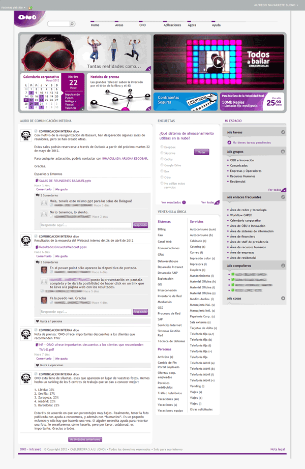
Spanish communications company ONO has a truly lovely looking intranet with pleasing shades of purples and lilacs, tasteful spacing and a nice array of graphics at the top. There is also a very prominent activity stream on the home page.
Despite being dominated by a ‘social’ element, ONO’s homepage is still packed full of useful ‘intranet’ features focusing both on internal communications and getting work done. These include news, a corporate calendar, links to applications and a personalized area, with specific tasks, groups and other links. Although social networking is fundamentally changing intranets, it doesn’t mean that some traditional intranet functions are decreasing in importance. The fact that they ONO has wrapped this into a design which delivers a consumer-orientated experience is even better.
Involving senior leaders
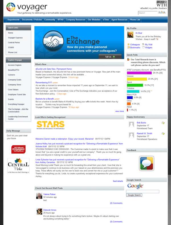
Although it might seem a small gesture, I love how World Travel Holdings’ entry discloses that its CEO posts personal birthday greetings directly on an employee’s wall, although clearly this would not be possible in a larger company.
Visible leadership support and involvement is important for social intranets. Not only does it emphasize the intranet’s strategic importance but if CEOs are directly posting content it legitimizes use and gives everybody ‘permission to play’, which helps to encourage adoption. Interaction with senior leaders is also important for creating two-way conversations and can demonstrate openness and transparency.

An integrated experience
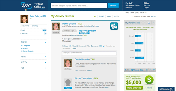
Social intranets often have to integrate different platforms and tools, sometimes with varying levels of success. IPC The Hospitalist Company’s entry reveals what looks like a very neat way of using activity streams to provide a seamless exposure to content across different systems. I particularly like the way the company has integrated updates to its video platform (‘TV’) as a separate tab within the activity stream, all too often a less integrated environment.
Focusing on business value
IPC’s entry also displays a real focus on business value. This is not only reflected in the name (“Virtual Office 2.0”) but also in the way microblogging threads are categorized under different set topics such as ‘Improving patient satisfaction’. IPC also appears to have made it very easy for users to configure the activity steam to the topics that are important to them at any given time: for example there is the ability to ‘unfollow’ a topic from one click within the activity stream itself.
Allowing non-business use
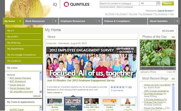
Business value is important, but also allowing non-business use for the intranet can also help adoption. Personally I like photo competitions and contributions as a good focus for user-generated content. I like the way Quintiles has surfaced this content on its homepage with a ‘Photo of the Day’.
The inclusive intranet
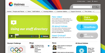
In my opinion Glasgow Housing Association’s Holmes intranet sends multiple messages about inclusivity. These include the cheery rainbow in the design, its strapline (“The intranet for the GHA family”) and features such as the “Think Yes” microsite, which includes the ability for all employees to submit ideas around improving customer service. I particularly like the name of the intranet, “Holmes”, which refers to both the organization’s ability to provide homes, and presumably something like Sherlock Holmes where you will be able to find information. It comes across as friendly, useful and reliable.
Dealing with risk
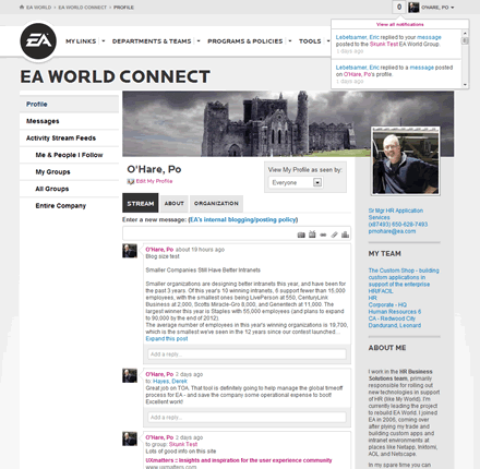
Risk departments sometimes get nervous about the ability for everybody to post content without moderation. This is despite the almost universal experience from social intranets that they are self-regulating as long as there is no anonymous posting allowed and there is a robust posting policy. I like the way Electronic Arts has posted a prominent link just above the box to add microblogging content to its internal blogging and posting policy. It doesn’t feel obtrusive but is clear enough to mitigate any concerns from risk management. Having clarity around a posting policy can also make new users more comfortable about using social tools.
How does your social intranet compare to our entries so far? If it’s as good, or even better, then make sure you enter the contest!
About the author
This is a guest post by Steve Bynghall. Steve was the content producer for IBF 24 2011 and helped research Paul Miller’s book “The Digital Workplace: How Technology is Liberating Work”. He is also a benchmarking evaluator and has written three research reports for IBF, and regularly blogs for DWF and IBF. Steve is the founder of Two Hives Ltd, a consultancy specializing in KM, collaboration and web-based projects. Steve previously worked at accountancy firm BDO in a variety of knowledge roles, including managing its global extranet programme. He has co-written a book on crowdsourcing with Ross Dawson titled “Getting Results from Crowds”. He tweets (less than he should do) at @bynghall.
Categorised in: Intranets
