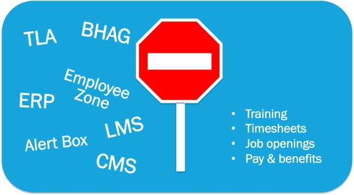
Keep it simple – set your users free from “corporate speak”
Does your intranet have an “Employee Zone”?
What can users expect to find in the “Alert Box”?
Do TLAs (three letter acronyms) rule your IA?
Large organizations are rather like countries when it comes to language. Over time, groups of employees evolve a dialect that, while clearly understood by those in the loop, can leave others bamboozled. Add to this the tendency to reduce complex terminology to TLAs (three letter acronyms) and to “coolify” services with snappy names and branding, and even Google Translate won’t help the average user.

The cost of corporate jargon on your intranet
While corporate jargon often serves a purpose – and might only confuse new employees – when this terminology creeps into the wider company intranet it can cause significant problems, such as:
Tagging
You may have implemented user-generated keywords and metadata, maybe even socialized your search, but what happens when thousands of unique tags are being created? If individuals and teams use their own specialist language to tag content, for everyone else, finding content becomes a game of “guess the tag” and those tags no longer serve a useful function.
Findability
Search isn’t everything and users often rely on clear and intuitive content categories to find what they are looking for. Calling your HR section “Employee Zone” may seem fun, but to an end user it might just be confusing. Try to use the simplest, clearest, most descriptive terms for your site sections.
Inclusivity
Faced with a long list of acronyms and jargon as navigation options, most users will feel overwhelmed. Intranets are intended to enable the sharing of information across divisional boundaries, but unexplained acronyms and specialist terminology will leave users feeling left out and unwelcome.
Efficiency
Users aren’t interested in cracking the secret code of your site. If they can’t see an immediate match for what they are looking for, several things might happen: they might go the long way round and use an offline process; they might miss valuable information or spend time completing tasks that could otherwise be finished quickly; or, worse still, they might simply give up.
While the cost of clarity is small, the cost of confusion is immeasurable.
Intranet jargon-busting tips
Want to ditch the jargon? Below are some simple steps all intranets can follow to keep their language clear. For a deeper look at this and related issues, see our classic report excerpt on Managing intranet content: A good practice guide.
Control the terminology
Establish a controlled vocabulary to define terms and phrases that can be shared by many resources. Make sure that this is regularly revised and reviewed by teams across the business. Once this is in place, a controlled list of terms can be used to improve search engine performance, drive social activity and allow users to tag and discover content and resources in many ways.
User-centred IA
Collect together related content into categories according to the user’s view of things, not the organizational structure. So, if more than one department publishes health and safety information, make sure it all gets presented in the same intranet section. Once content is grouped sensibly, label these sections with simple, descriptive terms. Tips for researching user-centred categories are included in our 2012 report Developing a user-centred intranet information architecture.
Get stakeholders on your side with user-centred design (UCD)
Intranet stakeholders often have no familiarity with UCD. Getting them interested and invested in a user-centred approach often requires a demonstration or example of its effectiveness, so perhaps you can start with some low-budget user experience research to show this. If you do nothing else, perhaps ask some new employees to make a list of terms they don’t understand on your intranet.
Glossary
If jargon and acronyms have to be used (and let’s be honest, sometimes they do), include a glossary tool where users can look up the terms. Adding this as a permanent link in the global navigation is a great way to ensure users can get to the tool easily, wherever they are in the site.
So, in a nutshell, good UX comes from UCD-based IA, poly-hierarchical taxonomic CMS systems and avoiding TLAs… Oops!
Research and resources

Free executive summary: Managing Intranet Content

Free executive summary: User-centred design for intranet information architecture

Digital Workplace Impact: Episode 8 – Real-world usability in the modern digital workplace
Categorised in: Uncategorized
