Intranet usability: 4 data analysis steps for card sorting exercises
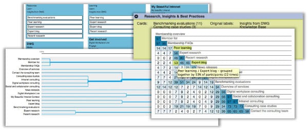
See a real-world analysis of card sorting results, based on an honest look at DWG’s own website. This key usability technique should be an important part of all intranet programmes.
In my blog post on tree testing task analysis we found a couple of problems with our website navigation structure.
- 15% of people failed to find “My Beautiful Intranet” under “News & Events”
- 91% failed to find “Benchmarking evaluations” under Membership.
I also had a sneaking suspicion that “News & Events” wasn’t a logical home for our “Expert blog”. I wonder how many of you find these posts through our fabulous email alerts rather than intuitively being able to find it in our navigation menu.
Well, our card sorting results are in!
Thanks to all those who participated, and with over 40 fully completed responses, I’ve been able to conduct a quick assessment and see where users logically group these items.
The Participant-Centric Analysis
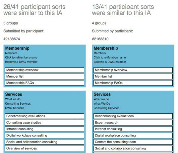
I usually start with this as it quickly tells me the three most commonly accepted ways in which users grouped and named content.

You can see from this screenshot that many users placed “Benchmarking evaluations” under a new category called “Services”.
This is a great insight: we’ve arranged our navigation according to what we do, separating “Membership” and “Consulting”, but our audience doesn’t differentiate.
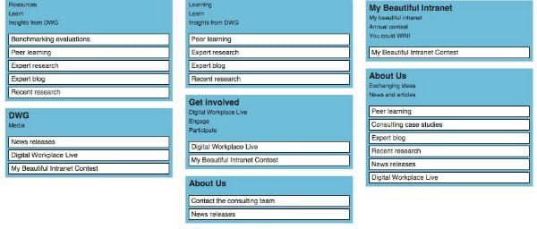
Interestingly, for “My Beautiful Intranet”, these groupings showed that users either placed it on its own with the same label or grouped it with “Digital Workplace Live” – but not under “News & Events”.

This view allows me to quickly see where users placed these items and how they labelled them.
The similarity matrix
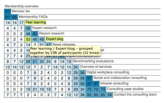
The similarity matrix shows the percentage of participants who agree with each card pairing. It clusters similar cards down the right edge, so you can see which cards relate most strongly to each other.
You can also look for the highest percentage of participant groupings for particular pairings.
For example; here you can see that my theory about the “Expert blog” might be correct in that it was most frequently paired with “Peer learning”, a label from another section entirely.

I use this grid to validate that users agree with my groupings, frequently pairing the same content together. The good news is that the blog content was also frequently paired with its siblings under “News & Events”.
It also allows you to quickly see where there are no strong correlations and pairings are scattered, such as with “Benchmarking evaluations”.
It’s worth keeping in mind that these are just pairings and what you miss here is the overall categorization that the Participant-Centric Analysis is so good at showing.
The dreaded dendrogram
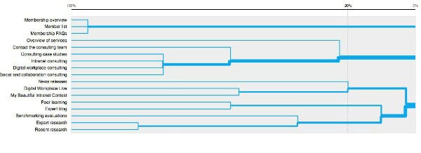
This view often makes my head hurt and is used to illustrate data clusters. It tells you the percentage of participants that agree with a grouping.
The vertical blue lines represent agreements between participants, while the vertical grey line that moves along the axis shows you the percentage of participants that agree.
It shows me here that just 20% of participants agreed that “My Beautiful Intranet” sits well with “News releases”.

User categories
I love this view. You have to spend time grouping and naming the categories at first as it duplicates them. But what I love about it is that, once you’ve cleaned it up, you can easily see additional category names and the cards within them suggested by your audience.
This helps me tune in to the language of the user and I often find real gems and great ideas for new category names here that I can take forwards and test.
It showed that many users created a “Research” based label. Here I can group similar labels (shown on the right) and then view which cards users placed on the left.

And this view is also really useful for grouping all the categories called “Don’t know” or “Other”, where users clearly grouped all the stuff they couldn’t categorize and gave it a generic title.
This shows me the trouble cards that users had difficulty placing.

And bingo! A few of our question items are here, such as the “Expert blog”, “Benchmarking evaluations” and “My Beautiful Intranet”.
So what’s the next step?
It’s important to note that you need to take all of this with a pinch of salt: labels are presented out of context of the site hierarchy, which can help give meaning to labels. Some cards often sound odd without their parent category in situ.
And, more importantly in any online study, it doesn’t tell you why in the way that speaking to a real person can. So, always supplement it with in-person card sorting.
And as for our website?
Who knows? I’ll need to speak to the marketing team—with limited navigation space, just as for everyone else, we need to compromise.
We may well need to consider grouping together what we do under a label like “Services” and then grouping all our insights, research and best practice, rather than separating it out across different areas.
And as for “My Beautiful Intranet”? — well, we don’t suffer from a lack of excellent entries and the contest gets a good share of promotion and homepage real estate when it’s on, so does it really need it’s own section? Probably not!
Related research
User-centred design (UCD) for intranet navigations
 Large corporate intranets serve diverse audiences and support multiple goals, but often they have evolved with little control, reaching mammoth proportions.
In this paper we set out the steps to developing an intranet information architecture (IA) using user-centred design (UCD) techniques, starting with why it is so hard to find an intuitive IA, and key success factors.
See Also
- 5 tips for setting up an intranet card sort online
- 7 tips for tree testing your intranet navigation
- 10 steps to interpreting intranet tree testing results
Categorised in: → Intranet usability, Content management, Intranets
