5 tips for setting up an intranet card sort online

As you know, I’m a big fan of tree testing and have written some previous blog posts on the subject (how to set up tree testing and how to analyse tree testing results). But I don’t want card sorting to be left on the virtual shelf. It’s also a really useful technique for improving usability.
I tend to use it when: 1) creating and validating new intranet navigation structures; 2) revising existing ones; or 3) tree testing, as a critical complimentary exercise to help me understand where users naturally group content items that have proved unsuccessful in tree testing.
Recently, through my tree testing analysis blog article, we discovered a problem with our own website. So now I’ve set up an online card sort to figure out what to do next.
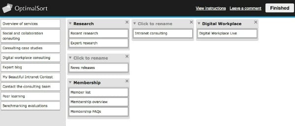
If you’ve never taken an online card sort, or you’re unsure what it is, then do take a look.
Also, I’m planning to write up the analysis in my next post. Right now I only have 34 completed responses and I’d like at least 50 before I look at the results in any great depth. So, please do get sorting for me!
5 critical tips for online card sort success
In the meantime, here are five tips on how to properly set up intranet card sorting.
Be clear on your objectives
I know this sounds silly… but it will help you set it up in the best possible way. Do you want to validate a proposed new structure? Do you want to understand how your users label specific content areas? Do you want to limit the scope to a specific area in your navigation or intranet? Which level navigation are you testing – top level or further down?
Open, closed or a combination?
- An open card sort allows users to group cards and then assign their own category names to these groups.
- Closed sorting means that users can only choose to group items under your prescribed categories.
- Hybrid sorting offers both. Users can group under your prescribed headings, as well as creating and naming their own categories.
Personally, I’m a fan of:
- Open if you’re starting afresh and looking for inspiration.
- Closed if you’re a control freak and don’t care whether users struggle with your labels.
- Hybrid if you’d like to test a proposed new structure but want the maximum feedback from users.
The reason why I like to go for hybrid rather than closed is that it gives me more useful feedback to work with. I’m not forcing users to choose between categories they might not think work for a particular card but have to place anyway. And it allows them autonomy to add and name groups they think are a better fit.
How many cards should you use?
How many cards do you think it is likely you would want to sort online before getting bored or abandoning ship? If you haven’t already done so, now try the sample card sort and see if you change your mind.
Some people advocate huge numbers of cards. But my view is that – particularly online – this is a challenge. You may get away with more cards during in-person testing as it is more interactive, but online I think 50 cards is an absolute head-hurting maximum.
Create meaningful card labels
Remember that actual navigation labels taken out of context of your site structure may not have any meaning when they stand alone. Try to describe the actual piece of content on the card – succinctly – rather than just copying the labels.
You should also be clear about what level navigation you are testing and ensure that all cards are from the same level, i.e. you’re testing primary navigation labels so you’re giving users second-level content items to group.
Another way to think about this is: Never have an item in a card sort that could logically be a subpage of another item in the card sort. For example, if “HR policies” is an item, then you can’t also have specific HR policies, such as the “Paid time off policy” in the same card sort.


Don’t forget the context
Online testing is great for gathering a good number of results in one go and helping to validate structures quickly with large numbers of employees in different geographies. However, often what is important is not just how the user groups a card or assigns a category label but what they actually say in the process when thinking aloud.
“I placed that there because…” statements are often the most informative, so a combination of in-person and online testing will yield the best results.
So, make sure you have a prominent box for comments and suggestions for users to give you feedback and also conduct offline group or one-to-one sessions as well.
How do you analyse results?
Hopefully, I’ve worn you all down so much that you’ve already decided to take the card sort. But if you haven’t, please do so and I will share the results next time.
More intranet card sorting resources
- Card sorting guide – boxes and arrows
- Card sorting guide – usability.gov
- Card sorting pushing users beyond terminology matches – NNg
- Get intranet stakeholders on your side with user centred design – DWG
- OptimalSort – online card sorting tool
- UserZoom – online card sorting software
- UXSort – online card sorting tool
Related research
User-centred design (UCD) for intranet navigation
Large corporate intranets serve diverse audiences and support multiple goals, but often they have evolved with little control, reaching mammoth proportions.
In this paper we set out the steps to developing an intranet information architecture (IA) using user-centred design (UCD) techniques, starting with why it is so hard to find an intuitive IA, and key success factors.
See Also
- 7 tips for tree testing your intranet navigation
- 10 steps to interpreting intranet tree testing results
- User-centered design for intranet navigation
Categorised in: → Intranet usability, Content management, Intranets
