10 steps to interpreting intranet tree testing results

No matter how well you design your Intranet tree testing exercise, the value comes from proper analysis. In this article read practical tips about how to effectively execute this very useful user experience technique.
My initial blog on tree testing was such a success last and the test itself received such a great response rate, I simply had to follow it up.
239 people participated in the sample test on our website structure. Thanks everyone!
I’m now going to share with you what to look for in the results and my interpretation and recommendations for improving our website. If you disagree or have other comments for us, please do get involved.
For those that missed the last blog and wonder what I’m talking about, read this first – 7 tips for tree testing.
Have you got enough data?
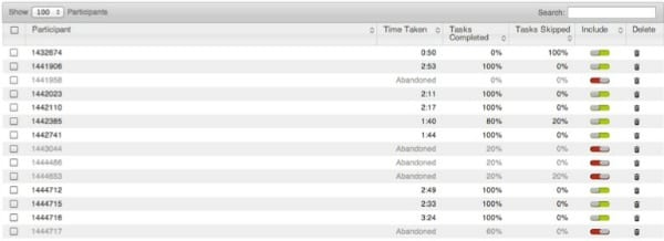
A minimum of 40 responses for any one intranet tree testing exercise is sufficient to start showing patterns but greater than 100 is ideal. So with 174 people having completed all 5 tasks, I’m happy to start looking at the results now.
What task completion rate am I happy to include?
I can choose to include results from users who have only completed some tasks. I might do this if I felt I had insufficient responses and wanted to widen the data set.

What do I look at first?
First I go for the pie charts for each task scanning for red; which indicates user failure and is what I’m most interested in.
Bingo! Houston, we have a problem…

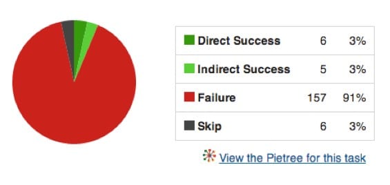
This is the only pie chart where I see mostly red and the results are bad! Just 6 people found the correct answer directly. 5 people found it but backtracked in the process. 157 failed completely and 6 skipped.
The task was:
- “I’d like to know how my intranet stacks up against the world’s leading intranets. Where would you go to find out how to measure the effectiveness of your intranet?”
The answer was:
What other information can we see related to a task?


The average time taken for this task was 21 seconds in comparison to 8-9 seconds on the tasks that scored better.
Directness is interesting in this context. A very poor success rate combined with high directness [users that didn’t backtrack in the process] usually equals users being pretty positive they are in the right place, when they’re actually not!
How do I investigate the issue?
The first thing I do is open the pie tree to see where users are going. Before you open it, the messier the picture, the more lost users are.

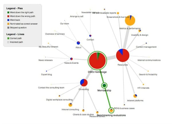
A quick colour tip: green lines = right path, grey lines = incorrect path, blue in a pie is backtracking and yellow is nominated as a correct answer.
Here I can quickly see at a glance that users are going all sorts of places but the largest yellow dot is Resources > Metrics & Performance.
This makes total sense – if you want to know how your intranet stacks up, you may well end up here.
What’s the conclusion?
My task question may have been ambiguous but I didn’t want to say ‘benchmarking’ as I would be giving away the answer.
I do wonder whether we are requiring our prospects to understand our offering – just like many companies require employees to understand their organisational structure to be able to navigate the intranet!
We offer membership and consulting – and our navigation menu reflects this. But that means that users must be curious enough to click on ‘membership’ to see what it includes.
Also – ‘Metrics & Performance’ is actually one of our four core intranet benchmarking areas, but is not the terminology we use internally to refer to our benchmarking. This label may be unclear and I’m curious as to whether it links to our “benchmarking evaluations” section. This wouldn’t make much sense to us internally, but it does to the user.
What else should I look for?
The destination chart is also interesting; it shows the destinations chosen for each task. Green indicates the correct answer and task numbers are at the top. I will often look for pages where users have continually selected a place as the correct answer but it isn’t.

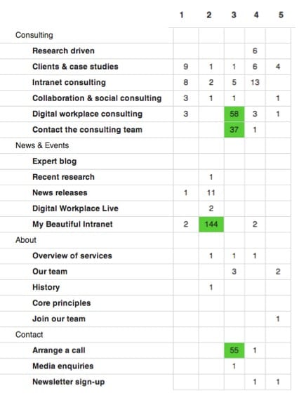
The downloadable spreadsheet provided by Optimal Workshop also shows a breakdown of destinations, first clicks, participant task success rates and correct / incorrect paths by user.
I could go on forever but I’m already at double my word count for the blog and I’m not done yet.
Don’t forget the limitations
Intranet tree testing is an amazing tool but there are some limitations. What we see on the page often influences our decisions and navigation path. The tree is presented out of any context.
It is also progressively revealed, unlike the website where you can potentially see more at a glance through hover-over menus and other navigational elements.
Complicated, isn’t it?
No, it’s not rocket science. I’m not a scientist or a statistician. I try look for the key themes and problem areas and then work on those.
I might be able to fix them right away or I might need to do some card sorting or user testing to help me further but I have a starting point. I now know what isn’t working.
Now, let’s fix it together
Now I know where the problem areas are, my goal is to understand where our audience would logically group it.
Related research
User-centred design (UCD) for intranet navigations
Large corporate intranets serve diverse audiences and support multiple goals, but often they have evolved with little control, reaching mammoth proportions.
In this paper we set out the steps to developing an intranet information architecture (IA) using user-centred design (UCD) techniques, starting with why it is so hard to find an intuitive IA, and key success factors.
Free executive summary »
See Also
- 5 tips for setting up an intranet card sort online
- 7 tips for tree testing your intranet navigation
- Intranet usability: 4 data analysis steps for card sorting exercises
Categorised in: → Intranet usability, Intranets
