The curse of intranet quick links (and how to do them right)
Many intranets feature a list of “quick links”, intended (one assumes) to give users access to important or popular content or services at the touch of a button.
Intranet quick links take up valuable space on the intranet homepage and seem almost universal. But they so often go wrong.
Indeed, some commentators would have them banned altogether. Gerry McGovern, for example, among all the fantastically good guidelines for writing links, implores us never to use the phrase “quick links”. But in the context of a vast sea of information the average user encounters on most intranets, there is something “life raft-ish” about spotting a short list of clearly written and welcome links to things you need or want.
5 common problems with intranet quick links
Should quick links be banned? As with most user experience (UX) questions, the answer is “it depends”. Here is our hit list of classic quick link problems:
#1 – The list is too long
The thing with lists is if they contain a lot of items, they get hard to read and the user needs to invest time and mental effort to find out if what they want is even in there.
#2 – The links are not “quick”
A quick link should take the user directly to the resource it refers to, otherwise it is just a link. When a user clicks on the link, they should jump straight to the thing they wanted without needing further clicks.
#3 – Links are ambiguous
Labels for quick links need to be clear and directly match the user’s needs. Targeting whole sections of the site is a job for the main navigation. Quick links should provide easy access to specific services or resources and the labels should match these exactly.
#4 – Links are unpredictable
Users quickly form ideas about the content you provide, right or wrong. When your content doesn’t match their expectation it’s confusing and frustrating. Why are these links in your list? How do they get there? Why do they keep changing? Decide what your quick links are for, explain or imply that on the interface, and stick to it.
#5 – They might be quick, but they’re not useful
While the rest of the site navigation may succumb to the pressures of politics and divisional publishing boundaries, quick links are sacred. Remember the life raft? Imagine your users climb aboard only to find the thing sinking under the weight of managerial profiles, corporate news and shareholder updates! Only add things your users genuinely want or need. Why not let users edit their own? Our testing shows that employees regularly rely on browser bookmarks to find content they use regularly or have trouble finding. Let your quick links do the job for them and they’ll thank you.
Example of well designed intranet quick links
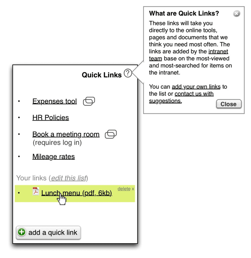
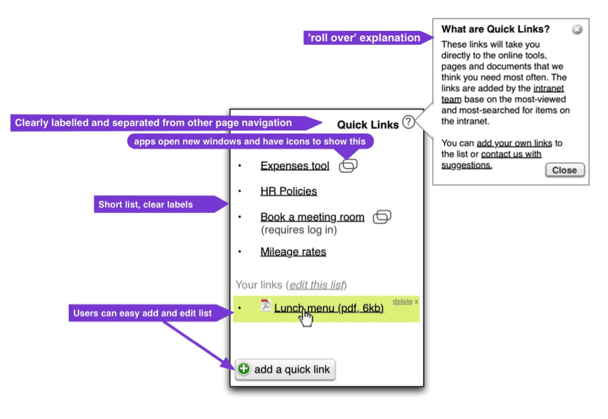
So if that’s the wrong, what makes quick links right? Well, if it were me, I’d want my quick links box to be something like this:  And here’s why (click image to enlarge):
8 guidelines for doing quick links right
#1 – Choose links by popularity & importance, not politics.
#2 – Keep the list short and scannable.
#3 – Link directly to applications, forms, etc.
#4 – Write clear, simple, jargon-free link text.
#5 – Note “new window” and file formats with icons.
#6 – Indicate if a separate login is needed.
#7 – Let users add their own links.
#8 – Offer a roll-over explanation.
So let’s banish the curse of the quick links. Users love them if they are truly helpful and truly quick. And in the real world of large-scale corporate intranets, they can rescue your users from drowning in a sea of content. Instead of outlawing quick links, let’s man the life rafts and give them the attention they deserve.
If you’re interested in improving your intranet’s usability, read about DWG’s usability benchmarking.
Categorised in: Intranets, Usability & design
