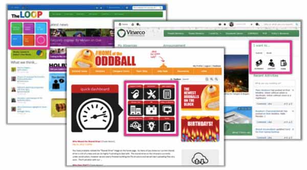
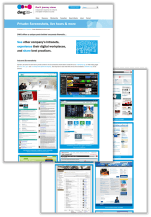
5 examples of task icons on the intranet homepage
See five different examples of how companies have used icons to highlight task-based actions on their intranet homepages, with screenshots and analysis.
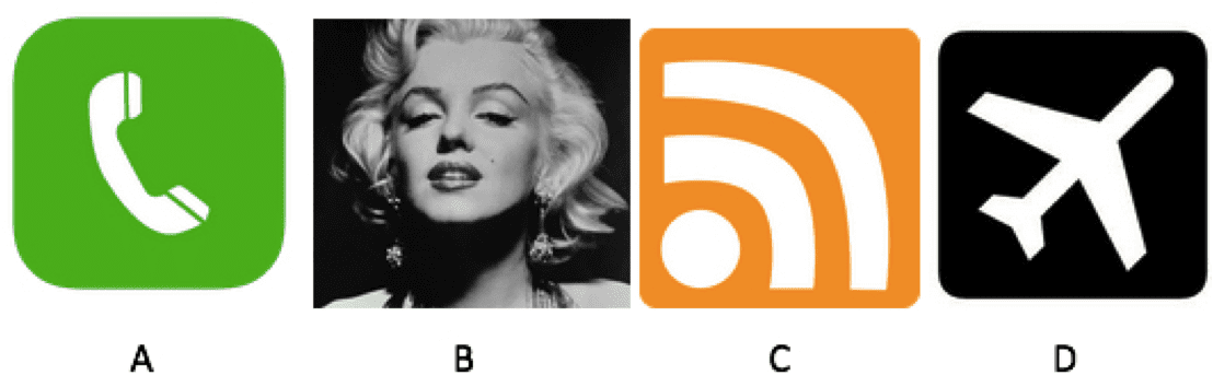
I have a quick game for you.
Spot the odd one out:
The answer, my friends, is C. Although now commonly recognized as the icon for RSS, it is the only one of the four icons that provides an abstract visualization of a concept; a metaphor for a hard-to-describe activity. The telephone handset (A) provides an easy-to-understand depiction of the task to make a phone call. The airplane (D), too, is easily understood as meaning “Here be planes”. And Marilyn Monroe (B) is, well, Marilyn Monroe. An icon in any language.
Icons as more than decoration
Icons are all around us. Whichever device you’re reading this post on, there are likely to be a number of them visible; perhaps a “Refresh” icon, a “Home” icon or the “Portrait orientation lock” icon at the top of your iPhone.
Far from being just a nice piece of decoration, icons perform an important role in helping communicate with users. They create a visual language that makes learning and navigating around a system or environment easier. They can help overcome language barriers (who hasn’t relied on the ubiquitous icon for “Toilet” in times of need in a foreign country?). They can play a key role in reinforcing a brand’s visual identity. In short, they help us know what something is.
And images have the potential to communicate much quicker than words. The human brain processes images incredibly fast, and a single image can trigger a whole raft of concepts and larger thoughts. The right visual imagery can be a massive communication shortcut, saving space on a web page, as well as the user’s time.
As the design and development of intranets begin to catch up to the outside world, the icon too is starting to make an appearance on intranet homepages. The icon’s ability to quickly communicate a concept and provide at-a-glance navigation is an attractive part of the designer’s toolkit, playing into an increased focus on creating an outstanding user experience (UX), as well as providing mobile access to platforms.
But, how best to make use of icons on your intranet homepage? Based on entries to My Beautiful Intranet 2014, we present here five examples of using icons for listing tasks.
Five tips for good icon design
If an icon is an important thing to design well, what do you need to take into consideration? How do you arrive at the best way of providing a visual cue for the task or information that you’re depicting?
Because every intranet’s design is different and every company culture is different, proper iconography can vary greatly. But a few key concepts hold true across the board.
Here are five tips for good icon design:
- Simplicity rules. Icons aren’t pictures. They should be simple, and recognizable at-a-glance. The more detail you include, the more the user needs to process before they can make a decision as to what the icon means and whether it’s the one they’re looking for.
- Sometimes a rose is just a rose. As tempting as it may be to pull out your poetry dictionary and provide an artistic interpretation of an expenses form, when it comes to icons an expenses form needs to be an expenses form.
- Research and test your metaphors. If there isn’t an obvious visual representation of the task you’re representing, then do some research. Hit the thesaurus, brainstorm related keywords and find the one that most effectively communicates the task at hand. Sketch out different visual representations and then test with users to find the most appropriate one.
- Treat icons as a family. It’s important to know where the icon will be used, and to also treat multiple icons as a group. There needs to be a consistent look and feel amongst the icons you’re designing and within the platform in which they’ll be used. If you’re using well-known icons, then apply your own style spin on them rather than using the out-of-the-box standard.
- Combine icon and label. Don’t rely on the icon to communicate what is being linked to. By including a simple label, you increase the chance that the user will understand what the icon is for, and help them learn the visual language you’ve created.
The recent Nielsen Norman Group article on the topic provides further analysis and recommendations: Icon Classification: Resemblance, Reference, and Arbitrary Icons.
Five examples of task icon on intranet homepages
Vinarco International – Icons as tasks
[two_third]
- Top right of page
- Consistent, minimalist design
- Simple design lets icon text stand out
- Tab name contributes context to tasks
- Section title positions user as actor
- Multiple tabs allow for shorter lists, greater use of available space
[/two_third][one_third_last] [/one_third_last]
About
Vinarco International’s use of icons is simple, and presented as part of a workflow that starts with the section title (“I want to…”) and ends with the task represented by the icon. The style of the icon family is consistent and minimalist, making use of flat design. The inclusion of labels makes it easy for first-time users to see what each icon is for.
How could these icons be made better?
The icon for “Support” could potentially be improved by replacing the checkbox with a headset on the avatar, which is a more familiar metaphor for support. But in our minds, this is overall an excellent example of intranet icon design.
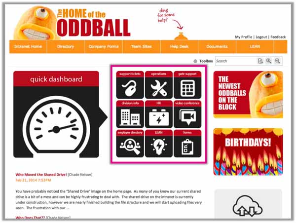
Oddball – Icons as metaphor
[two_third]
- Top middle of page
- Large simple iconography
- Consistent colors & design
- Mix of specific tasks and more general information
[/two_third][one_third_last] [/one_third_last]
About
The icons on Oddball’s intranet homepage feature prominently, acting as a dashboard to nine key tasks and bookmarks to information. The look and feel of the icons is consistent, meaning they work well as a family. The contrast of white on black means that it’s easy for the eye to make out the shape of each design, ticking the “simplicity” checkbox.
How could these icons be made better?
Although the styling of these icons is consistent, the metaphors for a number of them could be improved. For example, without the labels it would be difficult to know that the computer mouse stands for “Support tickets”, and that the battery means “HR”. Placing the labels beneath the icons, rather than above, could also help to improve the UX. Finally, a consistent level of information or task would be helpful. While some of these icons refer to very specific tasks (e.g. “support tickets” and “employee directory”), others refer to broad areas of information (e.g. “Operations” and “Division info”).
Wheatley Group – Icons as buttons
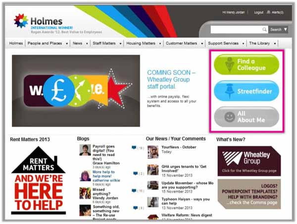
[two_third]
- Top right of page
- Large, simple, easy-to-read “buttons”
- Short list makes selection easy
- Different colors support memorability
- Text stronger visually than icons
- Large size & placement suggest high priority or very common tasks
[/two_third][one_third_last] [/one_third_last]
About
Similar to Vinarco, the Wheatley Group has placed its icons on the top right of its homepage. The icons themselves take a backseat, with much of the communication work carried out by the labels. The different colours for each button mean that, once you’ve learnt what each one means, it’s easier to identify which one you need.
How could these icons be made better?
The icons themselves aren’t a prominent part of this design. To be improved, more appropriate metaphors could be found that better depict the tasks at hand, and the colour of the icons could also be made stronger. The buttons themselves could also be given flatter edges, to bring the design more in line with the rest of the page. Using different background colours limits the potential number of icons.Three works well in this design, but if the intranet designers want to add more, the icon colour palette could get pretty wild.
Business Environment – 3D icons
[two_third]
- Top right of page
- Large, simple icons aid recognition
- Visuals much larger than text
- Visual variety helps with memorability
[/two_third][one_third_last] [/one_third_last]
About
Unlike the other icons we’ve seen so far, Business Environment has adopted a 3D look and feel for its design. Similar to Vinarco, the icons are presented as part of a workflow, headed with a title that reads “Take Me To…”. The metaphors and visual depictions are easy to understand, but are still supported by labels to aid recognition.
How could these icons be made better?
How could these icons be made better? For consistency, the icons for “Book Holidays” and “Suggestion Box” could be slightly rotated to face the left, similar to the icons for “My Page”, “Directories” and “Support”. This would make the group work better as a family. That said, the 3D icons feel a little heavy and “old-school”, like they were lifted from an MS Word clipart gallery. This is particularly true when played against the current trend of flat design. As a result, some custom design might modernize, simplify and tie together these icons.
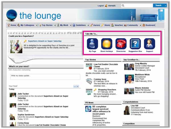
Children’s Trust – Icons as keyboard buttons
[two_third]
- Top leftt of page
- Color variety aids in memorability
- Use of color ties in with mission
- mix of specific and general infor.
[/two_third][one_third_last]
[/one_third_last]
About
The Children’s Trust uses icons in two places on its homepage: the top left and also in the centre. Both sets of icons make use of a keyboard motif, which works within the overall design of the homepage. Whilst the icons on the top left largely don’t make use of imagery, which works well within the space available, there are images used within the middle of the page where the icons are larger.
How could these icons be made better?
The look and feel of this icon family could be improved by making the label size and placement consistent on each button. The images used within each icon could also be made more consistent by treating them as part of the same language, using a similar line width and visual style. While the bright colours match the organization’s brand and culture, it can be visually overwhelming. Perhaps a more refined colour palette might make the icons easier to scan.
Do what’s right for you and test with users
This set of examples is meant to show the range of practices out in the world and provide inspiration to intranet and digital workplace managers. We don’t recommend copying any of these intranet examples; your own intranet design, corporate nomenclature and company culture should feed into something unique.
With this article we’re not necessarily advocating the use of icons on the intranet, but just demonstrating the variety of approaches we’ve seen. Our own user testing on various companies’ intranets has actually shown users ignoring the icons, the meanings of which they don’t understand.
The bottom line is that any intranet iconography should be carefully thought out, designed for simplicity and consistency, and tested with users. And if in doubt, leave them out.
[one_half]
More intranet screenshots
[/one_half] [one_half_last]
Digital Workplace Live
See monthly live tours
[/one_half_last]
Categorised in: → Intranet homepage, → Intranet usability