RPC unveils new redesign of its social intranet Edge
Going live last week, innovative London City-based legal services firm RPC unveiled a “Phase 2” refresh of its social intranet Edge. RPC is one of the case studies featured in our forthcoming research briefing “Social intranets: Putting people at the heart of the intranet”, which is due for release shortly. Other case studies featured in the research briefing are Alcatel-Lucent and Aviva. In the report we talk about Edge’s original development and launch.
It’s possible you may have seen Edge before. It featured as a tour on last year’s IBF 24 and generated some good reactions around the Twittersphere, it has been presented at KM World and was commended in last year’s Step Two Designs Intranet Innovation Awards Report. It’s also won some KM awards within the UK legal sector, so in general it’s been very well received. RPC worked with Headshift (now called Dachis Group London), a large social business consultancy, on both the original design of Edge and the Phase 2 refresh.
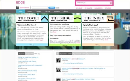
For a legal services firm intranet, Edge can be considered a bold move. The previous intranet was a traditional content-heavy and largely static site. Edge is a social intranet with a home-page dominated by personalised activity streams and news feeds, with a minimalist top-level navigation. It is delivered in unobtrusive colours, very different from the strong purple that is included in most instances of RPC’s corporate identity. This deliberately signalled that Edge was something new and different.
Largely powered by a wiki (Confluence), Edge features activity streams, external news feeds (supplied by Attensa), group spaces with wiki, blog, forum and micro-blogging capability, bookmarking (which can be done from within Internet Explorer via a menu item to “Send to Edge”) and a much simpler and devolved content management process. Most of Edge is custom-built in Ruby on Rails, and the various applications are surfaced through Dachis Group London’s ‘The Box’.
If Phase 1 was about establishing a “social layer” and perhaps the firm getting over the culture shock of something so new, then the Phase 2 upgrade refocuses Edge around making it easier to find essential content as well as highlighting communication from its two practice groups. Although it has only just been launched, on first glance it appears to have improved usability considerably. Initial reactions have been very good. One person from HR tweeted “liking it a lot, much better platform to build out comms and engagement.”
Communications around new clusters
Internally RPC has recently re-organised itself along two main business lines – Insurance and Corporates client groupings. Firm communications on Edge are now split between three areas: these two groupings and a third firmwide ‘channel’. All three feature on the home page. Each is branded with something a little like a newspaper title (there is an in-joke in each title – The Cover relates to Insurance for example – and is a reflection of the informal but professional company culture). Each ‘newspaper’ has an icon, and they’ve managed to keep a consistent design that still keeps the look and feel very clean and uncluttered.

Improving findability
The team has also introduced efforts to improve findability, for example making the search box larger and isolating it with a think pink border.
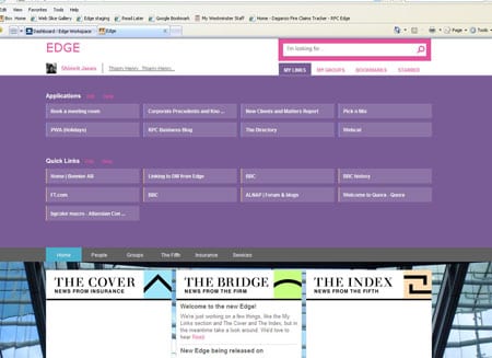
One of the popular new features on the Edge refresh is the introduction of “My Links” – essentially a set of personalised mega-menus. These effectively allow for a user-driven second layer of navigation. Rather than these being a vertical list, a user clicks on “My Links” (just under the search box) and a large panel opens.

Knowledge Management Project Leader Shimrit Janes explains that this function is regarded as an “apps box” and is “an expanding drawer that allows lawyers and business services to access a pre-set list of applications and resources that have been developed both within and outside of Edge, as well add in their own personlised quicklinks. The idea behind this refresh was to get the balance right between ‘social’ (eg our communities, the ‘serendipity’ of the activity streams, the ability to collaborate) and ‘intranet’ (ie finding content that lets you get on with your job quickly).”
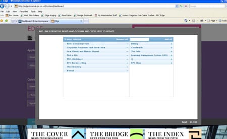
As always the challenge may be around getting good adoption, and getting users to configure the links themselves. A simple interface reached by clicking “Edit” in the MyLinks area makes it easy for users to choose the relevant links to different applications.

Other changes
Other changes that have been made include:
– An upgrade to version 3.5 of Confluence
– The use of a cleaner and fresher design to make it easier to see content, as well as updating Edge in-line with RPC’s recent brand refresh.
– The division of activity streams into ‘business’ activity, ‘community’ activity and ‘network’ activity. This reflects the way that the firm is now using Edge: to support its legal work as well as its culture, and encouraging lawyers and business services to build their internal networks.
– Edge can be viewed on iPads and iPhones remotely via their existing Citrix arrangement
– Other social tools based around the main “Insurance” and “Corporates” clusters reflecting the new firm structure
About the author
This is a guest post by Steve Bynghall. Steve was the content producer for IBF 24 2011 and helped research Paul Miller’s forthcoming book on the “Digital Workplace.” He regularly blogs for IBF and has been written research briefings on “HR intranets good practice” and “Social intranets.” Steve is also the author of Step Two Design’s annual Intranet Innovation Awards report. Steve is the founder of Two Hives Ltd, a consultancy specialising in KM, collaboration and web-based projects. Steve previously worked at accountancy firm BDO in a variety of knowledge roles, including managing their global extranet programme. He has just co-written a book on crowdsourcing with Ross Dawson titled “Getting Results from Crowds.”
Categorised in: → Social intranet, Intranets, Research reports
