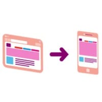
6 intranet usability truths that are magnified on smaller (mobile) screens
Most of the rules of intranet usability apply to mobile intranets and apps as well – but some of these rules have magnified importance and this article explains why.
 Autumn (or “Fall” for my US colleagues) is upon us folks and it’s already my sixth usability blog post in this series. So I feel compelled to present six great points.
My colleague Ephraim suggested the topic of the key differences between mobile and intranet desktop usability.
Fantastic timing, as here at DWG we will soon be benchmarking the usability of mobile intranets.
We’ve held off for some time as many of our members are still in early development phases. But now we’re starting to see good mobile experiences with the usability to match. Use cases run from transforming the world of work for frontline staff, to embedding company culture and processes, to engaging employees.
So what are the main differences, I hear you say?
Well, I’m sorry to disappoint, but good usability on a mobile device is basically consistent with good usability on the desktop.
In fact, all the standard rules for good usability are simply magnified on a smaller screen size.
I encourage you not to think about what’s different but instead to consider what makes good usability and to apply those rules.
6 usability truths that are magnified on smaller screens
Know your users
Your mobile experience, just like your desktop experience, will only work if it solves user needs and is simple and easy to use. So think about what your users REALLY need from a mobile experience and start here first.
Think about improving critical tasks for mobile or frontline employees, or starting with the basics of finding people, locations and expertise.
The first step towards knowing what your users really need is user research, preferably including direct observation, user journals, job shadowing, focus groups and other related usability techniques.
Prioritize key content and tasks
We often see cluttered intranet homepages on the desktop, with far too much content distracting users and no logical flow, i.e. there’s no sense of what’s most important.
Fortunately, on mobile you don’t have that luxury. Your stakeholders are competing for very limited screen space.
To create a clutter-free experience for enterprise mobile, start by designing for the audience first.
To create a clutter-free experience for enterprise mobile, start by designing for the audience first. If target audiences are on the move or work on the front line and want to connect on mobile devices, then design for small screens and let content expand to fit the desktop.
So before you put your standard navigation bar at the top of your mobile app or site, ask yourselves whether it’s important to users on the move to access all intranet content above all else.
And when it comes to content – cut the fluff and get straight to the point.
Smaller font sizes are harder to read
We often see intranets lose marks in benchmarking for poor readability where the text is too small or the colour contrast insufficient. Often users in testing get to the right place but miss the actual answer due to poor page structure and overly small text. This is even more true with mobile.
Many companies state that one of their key lessons learnt in user testing across mobile was to INCREASE the font size.
Images and icons must be recognizable and relevant
Again, we regularly see images that are too small to be easily recognized. Also consider that, if you’re using images as navigation aids, then the bigger the image the larger the target.
This is critical on mobile as fingers are simply much fatter than your cursor (no offence).
Processes must be logical
If you’re asking users to complete a task, all the steps in the process must be logical. Make sure the process works to begin with and then work out how to easily guide users through on smaller devices.
You don’t need to try and force users to fill in lots of detail all on one small screen; you can guide them through by progressively disclosing steps to complete.
Just like the desktop, the mobile intranet will simply highlight and expose to more employees any processes that don’t make sense.
Testing in person, early in the process, is paramount
For me, the most important step in developing your mobile app or site is to put it in front of users as early as you can in the process. You can mock up workflows and mobile pages in sketch form as well as testing prototypes.
Put it in front of your audience as soon as you can and then regularly throughout your development cycle to help you fine-tune.
So, there are more similarities than expected – most of the same issues, just with a bigger impact on a smaller device!
Related Research
[one_half]
[/one_half] [one_half_last]
[/one_half_last]
See Also
- 5 tips for setting up an intranet card sort online
- 5 intranet accessibility myths and how to address them
- Winners of My Beautiful Intranet 2014 (with screenshots) – see the mobile winner
Categorised in: Employee mobile, Intranet usability, Intranets, Intranets


