Announcing the winners of My Beautiful Intranet 2014 (with screenshots!)
In 2014, expectations for intranets are at an all time high; they have to be mobile, social, user friendly and focused on getting things done – and look good while achieving all those things. Winners of My Beautiful Intranet 2014 display the perfect balance.
Why does beauty matter in the digital workplace?
Unlike virtually all other animals, human beings have the ability to consciously appreciate beauty.
Sights in nature, such as watching the sun rise over the ocean, bring us peace, joy and meaning. We know that having plants in your office can increase your productivity. One of the iPhone’s most revolutionary characteristics was that it made the smartphone interface clean, pleasing and beautiful.
Unfortunately, many intranets and enterprise software platforms are not beautiful (that’s me being generous and diplomatic). Yet, workers spend more and more of their time in the digital world, immersed in digital workplaces.
If the future of work is one to look forward to, digital workplaces must be beautiful; they must evolve, just as office space has to be inspiring, colourful, clean, helpful and adaptive.
Why do intranets matter in the digital workplace?
More than virtually any other aspect of digital workplaces, intranets offer the opportunity for good design. Now that intranets integrate social features and collaborative tools, and are expected to be mobile accessible, they are more important than ever to productivity and company culture.
This contest is here to highlight the role of good design and aesthetics in the world of digital working. And the winners of My Beautiful Intranet 2014 demonstrate that good design is about so much more than just a pretty colour palette.
Voting & judging: checks and balances
Voting was open to the public and people could vote for all the entries they liked. But garnering the most votes did not a winner make.
The five entries with the most votes were automatically included in the top 10 entries considered by the judges.
But the judges for My Beautiful Intranet 2014 hand-selected another five entries for consideration for the winning spots. This meant that a voting campaign alone could not win the competition.
Our judging panel included three experienced practitioners from the intranet and digital workplace field, along with one of DWG’s own Usability Evaluators.
Selection criteria: More than just rich branding
Our judges assessed this year’s entries on how each struck a balance against the following criteria:
- use of good visual design standards
- creativity in applying visuals that enhance a site’s impact
- cleanliness and clarity of design
- apparent usability (you can only be scientific through user testing)
- functionality and usefulness
As you can see from this list, a pleasing or clever visual design was not enough to win.
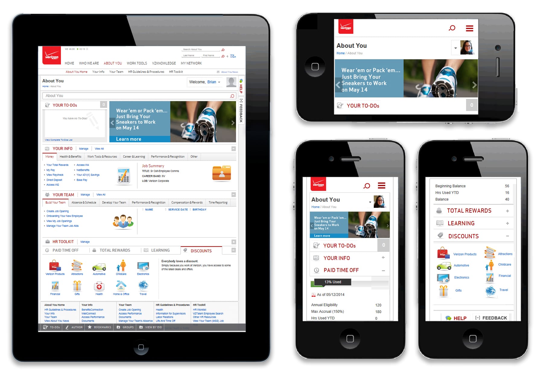
Winner for the “Mobile” track: Verizon
See Verizon’s entry in My Beautiful Intranet 2014.
About Verizon
Verizon is a global telecommunications company based in the United States and has over 180,000 employees around the world. It provides wireless services and devices, and phone, internet and TV services to residences and businesses.
Verizon’s mobile intranet: optimized and integrated
Verizon’s newly launched intranet features responsive web design. This means that the site’s layout, navigation and imagery adapt to look good on different screen sizes.
Verizon designs its intranet content to work well on smartphones. For example, see the image of the “Discounts” menu above, where large visual icons let users easily tap on a smartphone’s touchscreen.
What really makes the Verizon mobile intranet stand out though, is that it has achieved all of this as well as integrating much of their HR information into the intranet. Employees can find their personalized paid time off balances, paycheck information, and so on,. via the intranet on their mobile devices, without having to log in to the HR portal.
This level of design for mobile, combined with rich HR system integration, makes Verizon’s new mobile intranet an outstanding example of what modern intranets can be.
Congratulations to the Verizon team!
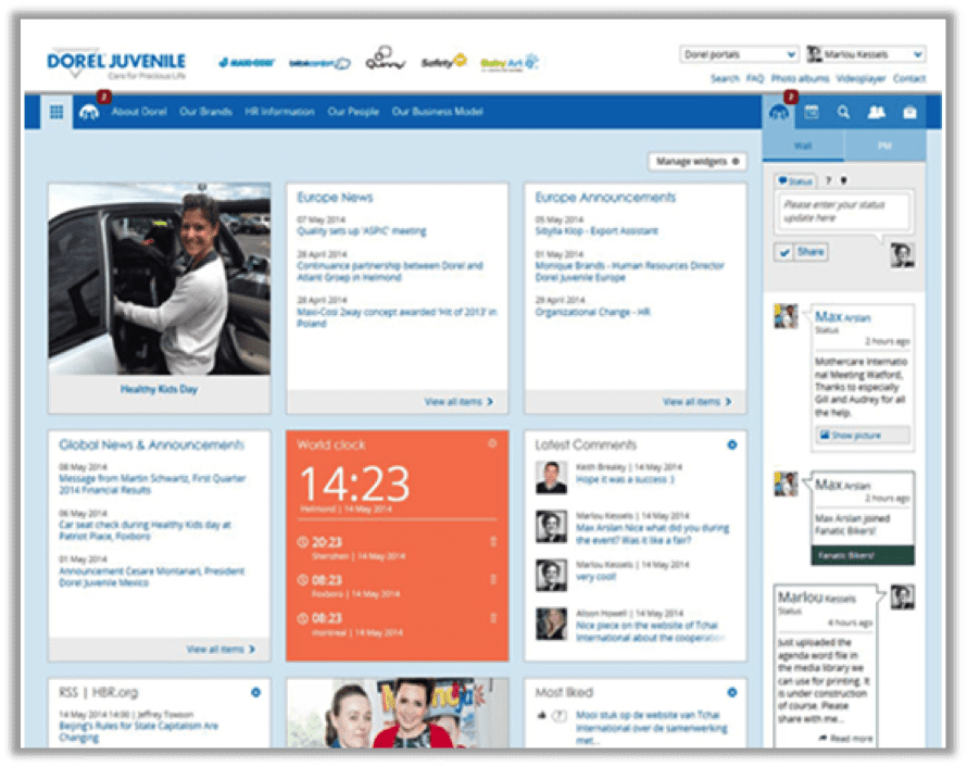
Winner for the main “Intranet” contest: Dorel Juvenile Europe
See Dorel Juvenile Europe’s entry in My Beautiful Intranet 2014.
About Dorel Juvenile Europe
Dorel Juvenile Europe creates products for babies and children including, for example, the well-known Safety 1st line of car seats and other child safety devices.
Dorel Juvenile Europe employs 1,300 people in 13 countries and is part of the much larger Dorel Industries Inc. Dorel Industries includes many well-known “juvenile product” brands as well as popular bicycle brands such as Schwinn and Cannondale.
Beauty beyond basic branding
I’ll be honest – the Dorel Juvenile intranet isn’t the most visually stunning of all the entries in My Beautiful Intranet 2014. But the clean visual design combined with all the other features illustrated on the homepage makes for an extremely well-rounded intranet.
Standout features include:
- clean, consistent visual design
- responsive design that adapts to different screen sizes (e.g. “mobile ready”)
- straightforward global navigation
- customizable homepage widgets
- personalized news and content
- balance of centralized news with user-generated homepage content
- well-integrated social and collaborative features (as opposed to having a separate collaboration platform)
- innovative right-hand column with interactive and collaborative tools.
Social, mobile, human, work-focused
The bottom line is that Dorel Juvenile’s intranet is a fully modern intranet that beautifully balances many important elements. Its integration of collaborative tools and social content makes it a real nexus for the company’s digital workplace.
The homepage feels alive, personal and useful. It is as much about people and conversations as it is about content and work.
Dorel Juvenile Europe’s intranet is everything a modern intranet should be, wrapped in a clean and inviting visual design that is pleasing but not distracting.
Congratulations to the team at Dorel Juvenile Europe!
Honorable mention: Adobe
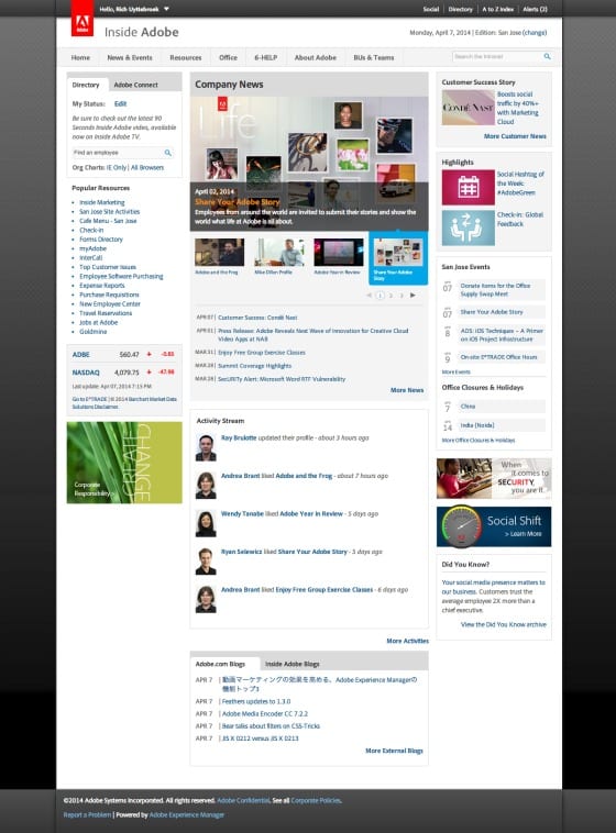
About Adobe
Adobe is a multinational provider of digital marketing and digital media solutions. Best known for products such as Adobe Acrobat Reader and Photoshop, Adobe is based in northern California and employs over 11,000 people worldwide.
Excelling at “invisible design”
Similar to the Dorel Juvenile Europe intranet, Adobe’s site offers clean and simple design.
While design in art is about colours, lines and structures, design for products that we use (including websites and intranets) has a very different ethos. Good design makes an intranet easy to use and eliminates distractions and complexity.
In essence, good intranet design hides the complex workings of the system and instead presents a simple interface. In this area Adobe’s intranet stands as an excellent example.
The clean lines and simple colour palette let the content do the talking. Thoughtful navigation and headings provide quick access to needed content. And rich personalization gets targeted information to the right employees seamlessly.
Standout elements include:
- clean lines and simple colours
- integrated social features
- impressive personalization based on location, department and role
- location-based “Editions”
- content under the “Office” page
- “Resources” links on the homepage
- news
- homepage calendars
- social stream
- balance of news and task-based content
- easy homepage news carousel
The Adobe intranet came in second behind Dorel Juvenile Europe’s partly because it 1) lacks a clear design for mobile responsiveness and 2) includes less robust collaborative features. But it’s still an outstanding intranet that balances rich features with lovely design.
Rounding out the top five intranets
The other three intranets in our top five offer rich visual designs, but with slightly less integration of social and less balanced features than our winner and runner-up.
These three sites provide beautifully branded and designed visual layouts; include social features; and provide task-based tools and information.
Congratulations to these three entries for making our top-five list:
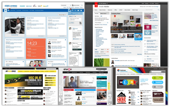
Mediterranean Shipping Company intranet
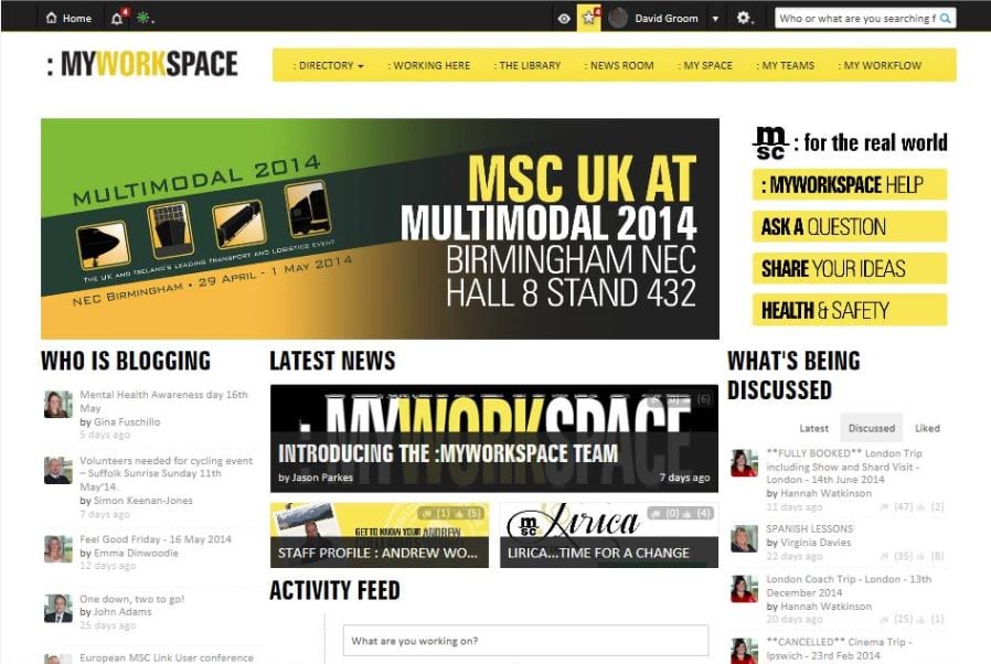
What made MSC’s intranet stand out: simple color palette, surfacing of user-generated content, simple highlighted tasks and topics on the right side of the homepage.
PUB intranet
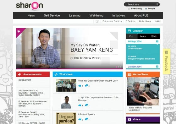
What made PUB’s intranet stand out: Clean and simple design, use of different colors to differentiate the sections of the homepage, “Feedback” tab, light-hearted and welcoming background imagery.
Wheatley Group intranet
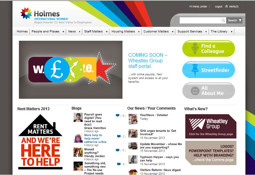
What made Wheatley Group’s intranet stand out: Rich use of colors without being overwhelming, strong and simple focus on top tasks, highlighting of user-generated content.
What’s next for intranets?
Just as we’ve come to expect much more from websites than we did 10 years ago, so too have our expectations for intranets increased.
Good intranets today integrate multiple systems from the digital workplace into one seamless experience. They offer consistent and user-friendly design that helps employees do their work more easily.
They provide rich online social interactions that connect employees to each other and their shared company culture. They help dispersed teams work together better via collaborative tools.
And they are accessible from anywhere on any device.
Intranets have to do more than ever before and do everything better than they have in the past. This is why the quality of their designs is so important and why they will continue to be the centerpieces of most companies’ digital workplaces.
Related research
Successful social intranets – creating business value through strategic alignment and adoption planning
Lack of strategy, spotty adoption, and the absence of a strong business case have been identified as key barriers to successfully deploying social intranets.

This report seeks to provide some clear guidance on both building a social intranet business case and addressing the challenges of adoption.